
Introduction
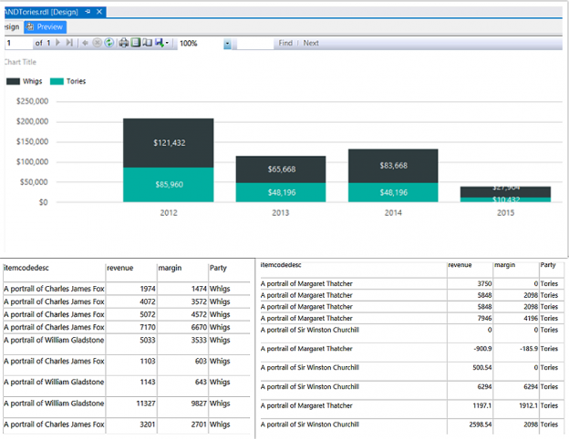
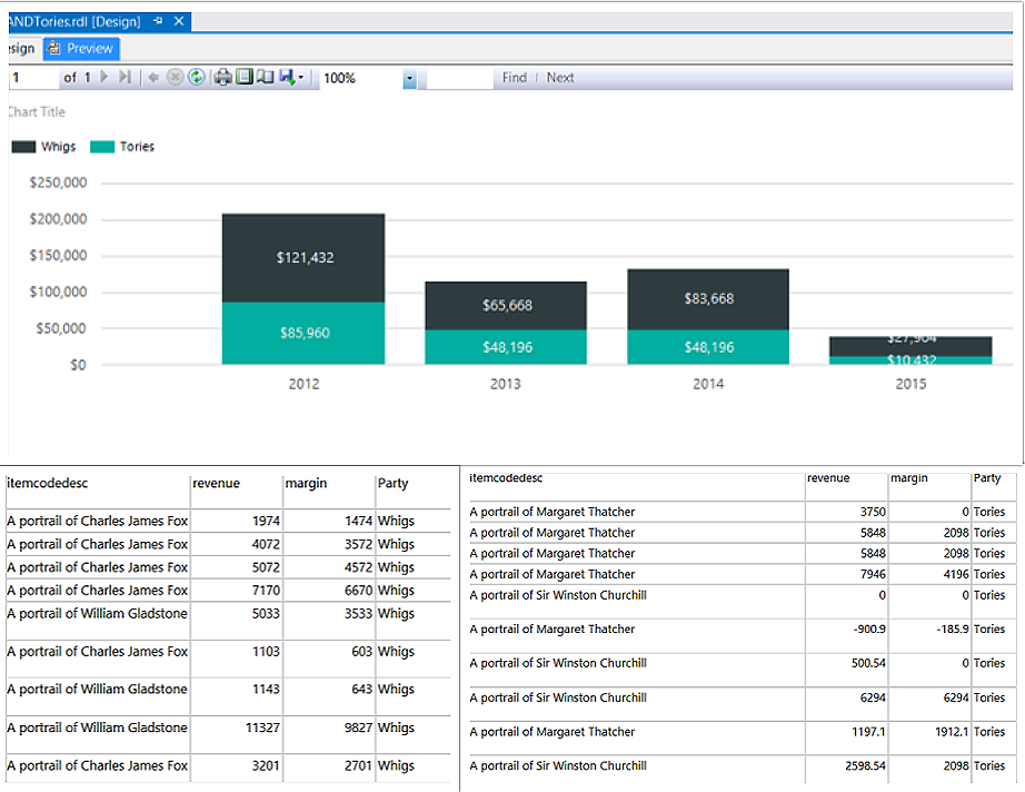
As many of you by now know, I am a fan of utilizing expressions within Reporting Services reports to add additional flexibility. Recently I received a client request to create a stacked bar report which in turn would provide access to the underlying data the made up the bars on the chart. My client sells two articles: “Whigs” and “Tories”. Many people like to “buy” them.The idea is to display the aggregated data as may be seen below (gray black and turquoise) and depending on which bar and color is selected( clicked upon), to drill down and to display the underlying detailed data (see below).
In today’s “fire side chat”, we are going discuss how the report may be constructed in an efficient and effective manner.
Let’s get started!
Getting started
We begin our journey by having a quick look at the raw data which has been loaded into our SQLShack database.
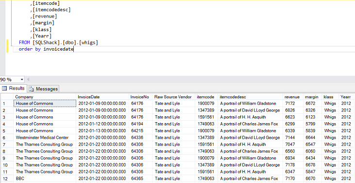
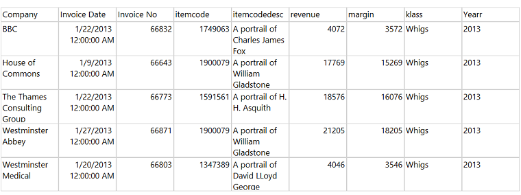
The contents of the Whig table may be seen above.
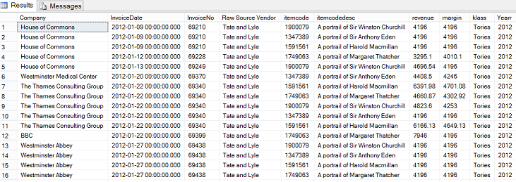
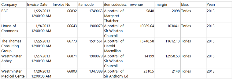
The contents of the Tories table may be seen above.
Now that we have had a quick look at the data behind our report, it is now time to begin constructing our client’s report.
Creating our client’s report
Opening Visual Studio 2015 or SQL Server Data Tools 2010 or greater, we create a new Reporting Services project.
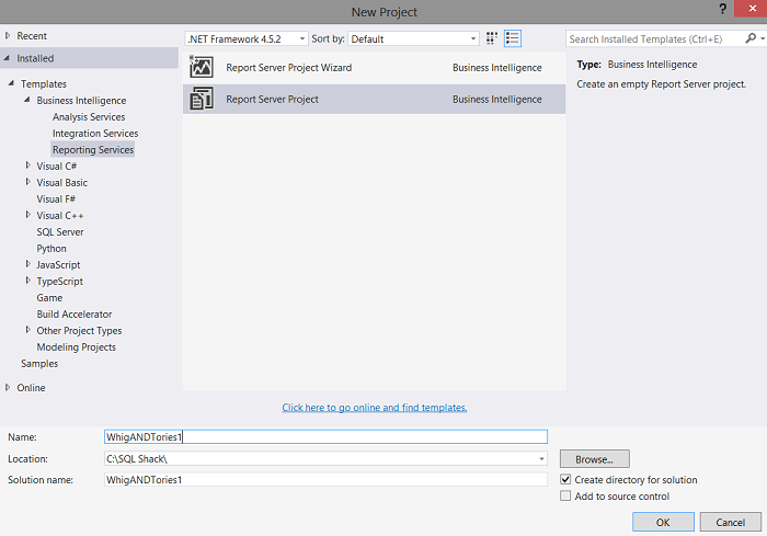
We give our project a name and click “OK” to create the project.

We find ourselves on our drawing surface.
Should setting up a SQL Server Reporting Services project not be your forte, then please do a look at a SQL Shack article entitled “Now you see it, Now you don’t” where the process is described in detail. The link to this article may be seen below:
Having arrived on our drawing surface, our first task is to create a data connection to the SQLShack database.
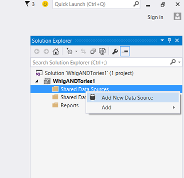
By right-clicking upon the “Shared Data Source” tab, we select “Add New Data Source” (see above).
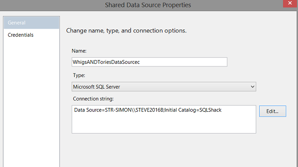
The “Shared Data Source Properties” dialogue box appears. We give our “Shared data source” a name and set the connection string to point to the SQLShack database (see above). We click “OK” to leave the “Shared Data Source Properties” screen.
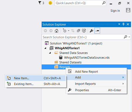
We find ourselves back upon the design surface. We right click on the “Reports” tab to bring up the context menu (see above). We select “Add” and “New Item”.
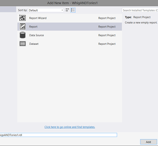
We select “Report” from the “Add New Item” menu and give our report a name (see above).
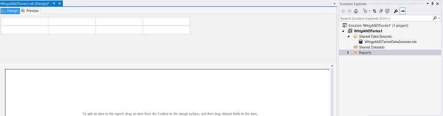
Once again, we find ourselves on our drawing surface (see above).
Our next task is to create a local data source and a local data set which will provide our report with the necessary data. As I have discussed in past “get togethers”, we tend to utilize local data sources and local datasets (in our reports) as the two permit an added degree of customization, exclusive to that report only.
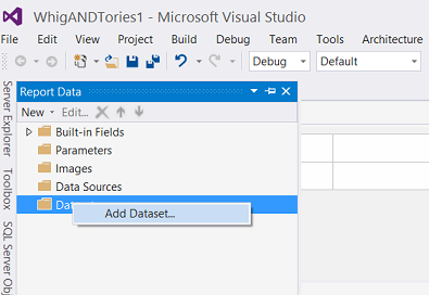
We right click upon the “Datasets” tab and select “Add Dataset” from the context menu (see above).
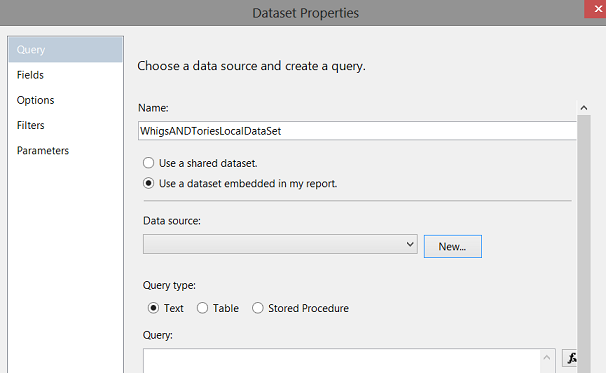
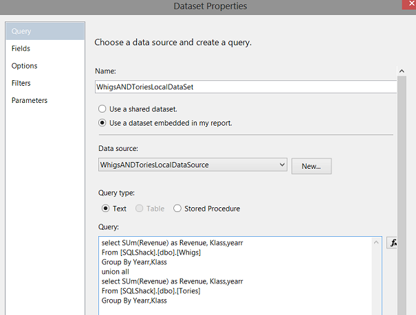
The “Dataset Properties” dialogue box opens. We give our proposed dataset a name and we select the “Use a dataset embedded in my report” option (see above). At this point, we must create a new “local data source” thus we click the “New” button (see above).
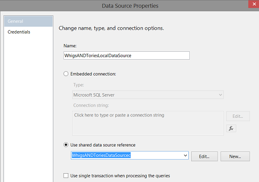
The “Data Source Properties” dialogue box appears. We give our local data source a name and link it to the “Shared Data Source” that we created above (see screen shot above). We click “OK” to continue.
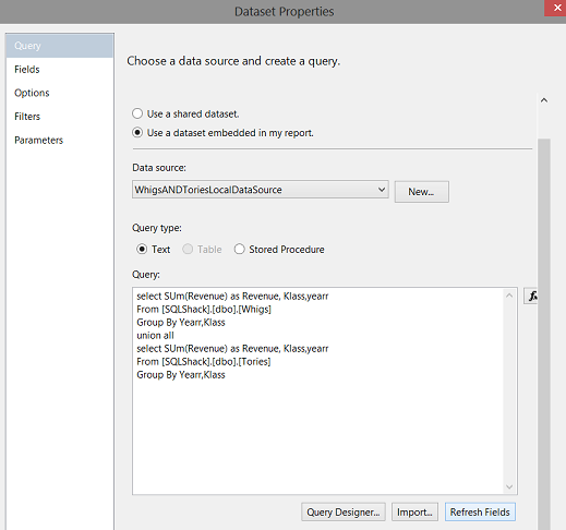
We find ourselves back on the “Dataset Properties” dialogue page. We select “Text” for the query type and add our code (see above). Now the “eagle-eyed” reader will suggest the utilization of a stored procedure instead of the text code which I just used. I totally agree and in a true life scenario, I would utilize a stored procedure so as well.
We click “Refresh Fields” and switch to the “Fields” tab.
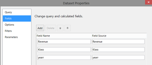
Having clicked the “Fields” tab, we note that fields that will be utilized by our “Bar Chart” report (see above). We click “OK” to leave the “Dataset Properties” dialogue box.
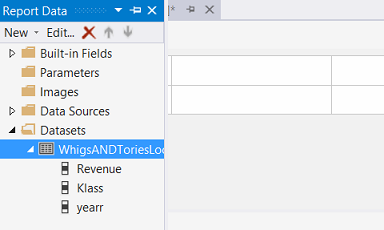
Once again we find ourselves back upon our drawing surface and we note the dataset that we just created, is now visible (see above and to the left).
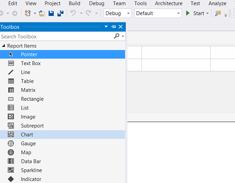
Opening the “Toolbox” we now opt to place a “Chart” on our drawing surface (see above).
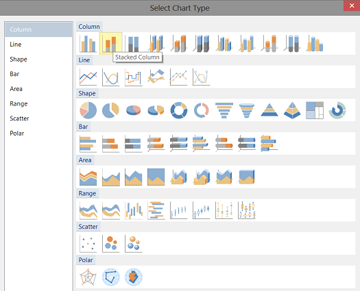
The “Select Chart Type” dialogue box appears. We select a “Stacked Column” column chart (see above).
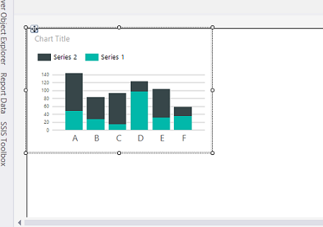
The “Stacked Column” chart has been placed upon our drawing surface(see above).
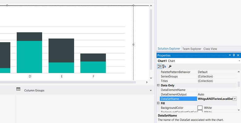
We now open the chart’s properties box by clicking on the chart and pressing F4 and set the “DataSetName” to the name of the local data set that we created above (see screenshot above).
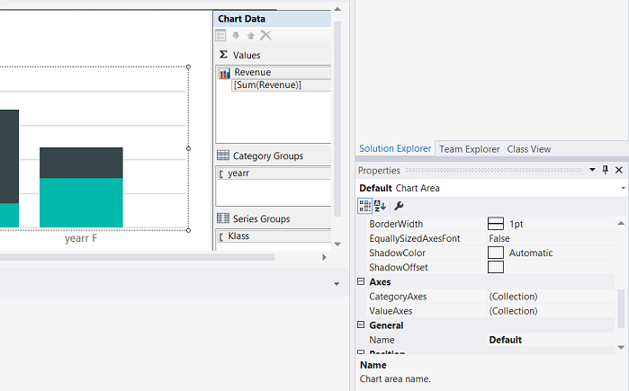
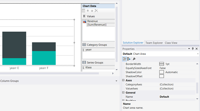
We now click on the chart to bring up the “Chart Data” box. We set the “Values” tab to sum the revenue, the “Categories Group” to the Year and last but not least, the “Series Group” to the “Klass” (which consists of two values, “Whigs” and “Tories”).
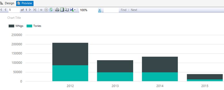
Clicking the preview tab (see above) we run our report.
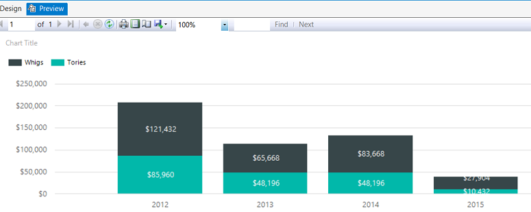
We now do a tad of cosmetic change to the report by formatting the axes and by adding data labels as may be seen above.
Creating our Sub Reports
As we discussed in the introduction, the client had requested to view the raw data that made up the different segments of the stacked bar chart. The client and I had agreed that he would click on either the black or turquoise portion of the chart, for any year and the underlying data for that year would be displayed in a separate report.
Our current task is to make this happen.
Inside Management Studio
Opening SQL Server Management Studio, we shall create two stored procedures, which will be called when the end user clicks upon one of the segments of the vertical bar chart. If the end user clicks upon the “black” portion then “GetWhigs” stored procedure will be executed. If the user clicks upon the “turquoise” portion of the chart then the “GetTories” stored procedure will be executed.
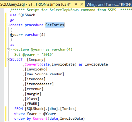
The “GetTories” stored procedure may be seen above.
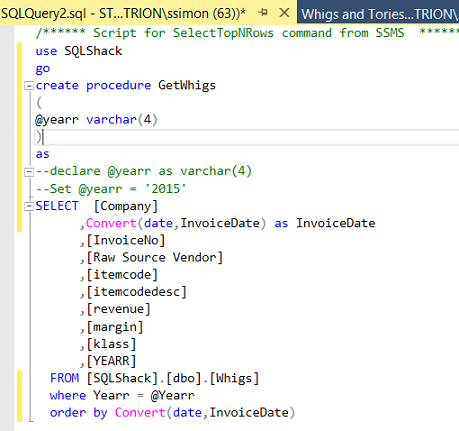
The “GetWhigs” store procedure may be seen above.
Before leaving management studio, we note that a parameter called “@yearr” has been added to both query predicates. This value will be passed to the query/stored procedure at run time.
We shall now leave SQL Server Management Studio and begin the construction of our two sub reports.
Creating the sub reports
In a similar fashion to the report that we created above, we create a Whig and a Tory sub report. We shall be designing the Whig report. It is left to the reader to design the report for the Tories.
Once again, should not be familiar with the process of configuring a Reporting Services Matrix / Tablix please do have a look at a SQL Shack article entitled “Queries, matrices, pivot tables and more” where the process is described in detail. The link to this article may be seen below:
Queries, matrices, pivot tables and more
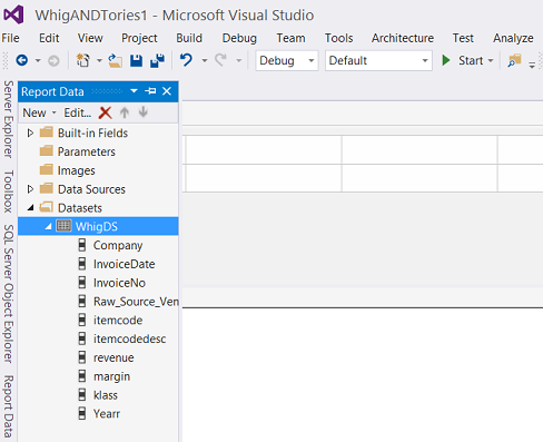
We create a local dataset for the Whigs (see above). However there is one difference this time in that we must add the @yearr parameter (discussed immediately above) as the value of year must be passed to the sub report’s stored procedure.

As a reminder, the code behind the dataset may be seen above.
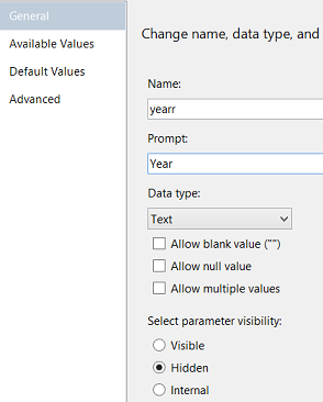
We create a parameter called @yearr in a similar fashion to the parameters that we have created in past chats (see above).
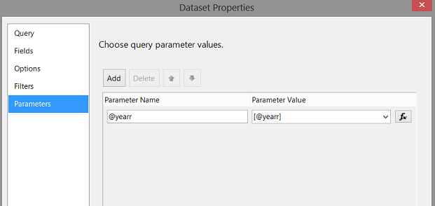
Finally, we set the Parameters of the dataset “WhigDS” to point to our “@yearr” parameter and the value to be passed to the stored procedure. We click “OK” to leave the “Dataset properties” dialogue box. We find ourselves upon our design surface.
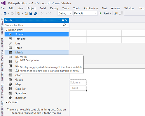
Our next task is to add a Matrix to our design surface (see above).
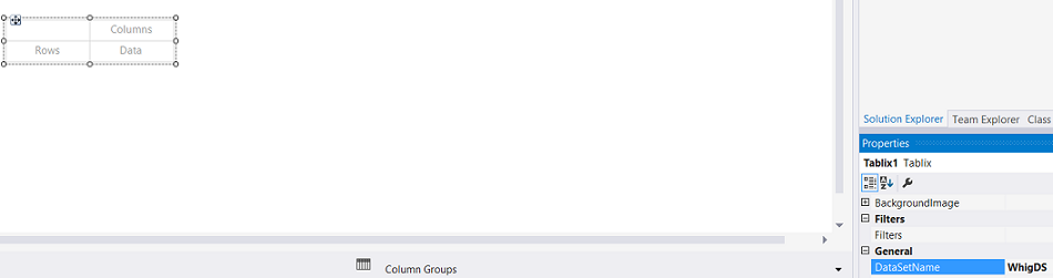
We set the dataset property of the Tablix to the dataset (“WhigDS”) that we just created.
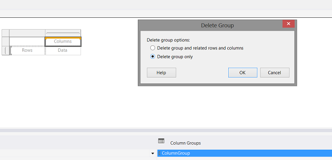
As we have done in past get togethers, we remove the Column Groups. Note that we opt to delete only the grouping(see above).
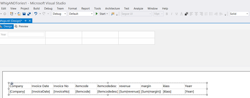
Now that the Tablix’s / Matrix‘s dataset property is pointing to the dataset that we just created, we are able to populate the columns of the matrix (see above).
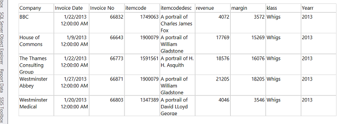
By adding a default year e.g.2013 (PURELY FOR TESTING PURPOSES), we are able to extract the following data for 2013.
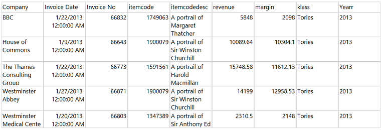
By adding a similar default value to the “Tories” report, we are able to obtain the necessary data for the default year, 2013 (see above).
We have now finished creating the necessary sub report infrastructure and we are now in a position to connect all the “dots”.
Putting our story together!!
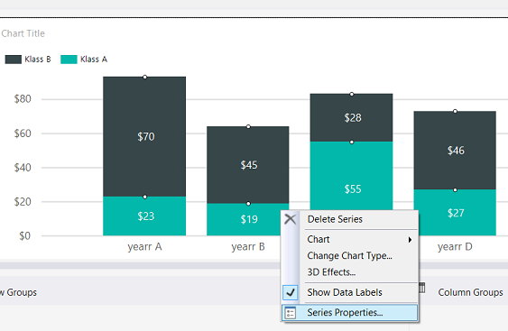
Back in our main report, we right click upon any of the vertical columns within our chart. The context menu is brought up. We select “Series Properties” (see above).
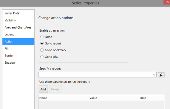
The “Series Properties” dialogue box opens. We select the “Action” tab and click upon the “Go to report” radio button (see above).
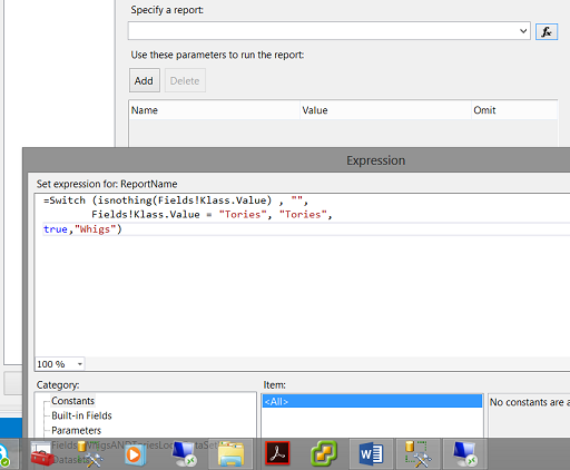
Our next task is to “Specify a report”. For this, we shall create an expression (see the expression above). We click “OK” to leave the “Expressions” dialogue box.
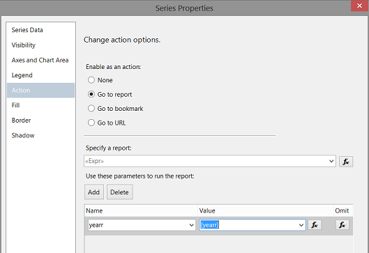
Our last task is to add the @yearr parameter (to run the report) along with the value for the year “[yearr]” (which will automatically come from the “Categories Group”). The two (the parameter and its argument) are then passed to the respective stored procedure.
Let us give our Main report a whirl!!
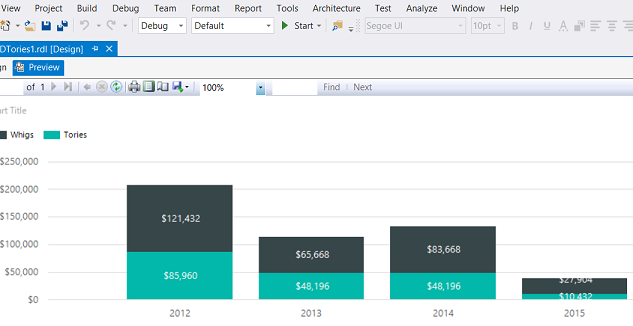
Once again, we click the “Preview” tab on the main report. We see the results of “Whig” and “Tory” sales for the yearly period 2012 through 2015.
Now, if we click upon the black colored “Whigs” portion of the column for the year 2013 we find that our sub report displays “Whig” data (see below).
and if we click upon the turquoise portion of the same vertical column, we find that “Tory” based data is shown.
Thus our main report and our two sub reports have been successfully created and connected. We have therefore achieved what we started out to achieve for this “get-together”.
One final note. It has often been suggested to have only the one matrix and to filter the data (to be shown within the matrix). This will work if and only if the structure of both sub reports is the same. In our case at hand, they are, however, the method that we have just been discussing permits flexibility and the ability to select from a plethora of heterogeneous reports.
Conclusions
Versatility is of prime importance when it comes to creating efficient and effective reports. Expressions utilized in a wise fashion can make the difference between a “hum drum” report and one that is truly dynamic at run time. I trust that you will attempt this exercise with some of your reports and as always, your feedback is always appreciated.
Until our next “fire side” chat, happy programming!
References
- Expression Uses in Reports (Report Builder and SSRS)
- Create a Matrix (Report Builder and SSRS)
- Expression Examples (Report Builder and SSRS)
Steve has presented papers at 8 PASS Summits and one at PASS Europe 2009 and 2010. He has recently presented a Master Data Services presentation at the PASS Amsterdam Rally.
Steve has presented 5 papers at the Information Builders' Summits. He is a PASS regional mentor.
View all posts by Steve Simon
- Reporting in SQL Server – Using calculated Expressions within reports - December 19, 2016
- How to use Expressions within SQL Server Reporting Services to create efficient reports - December 9, 2016
- How to use SQL Server Data Quality Services to ensure the correct aggregation of data - November 9, 2016