
Introduction
In our last “fireside chat” we discussed a few of the challenges that the HR Manager of a major hardware chain was experiencing. Mary Smith, the HR manager has since approached us to modify her existing reports to function more efficiently and effectively by utilizing her existing data, yet reduce the total number of reports.
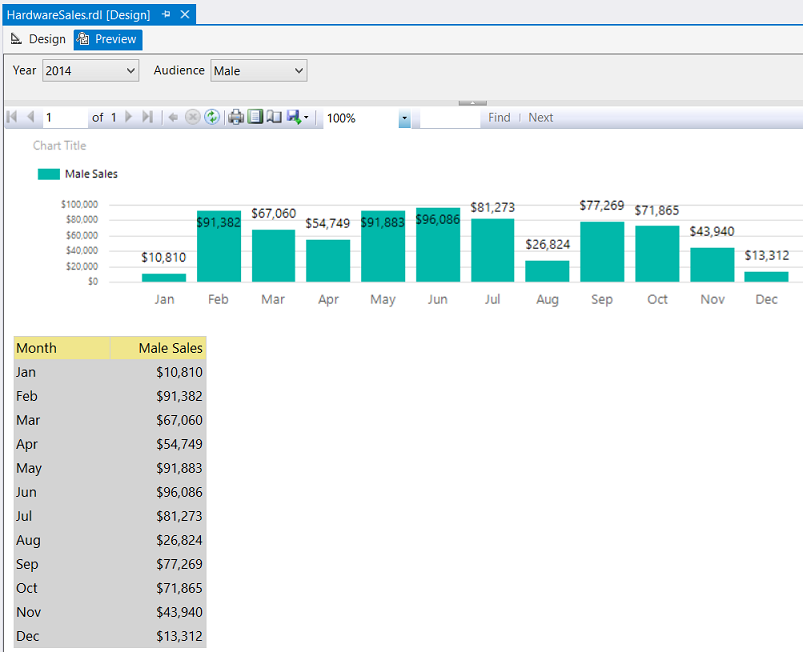
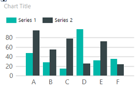
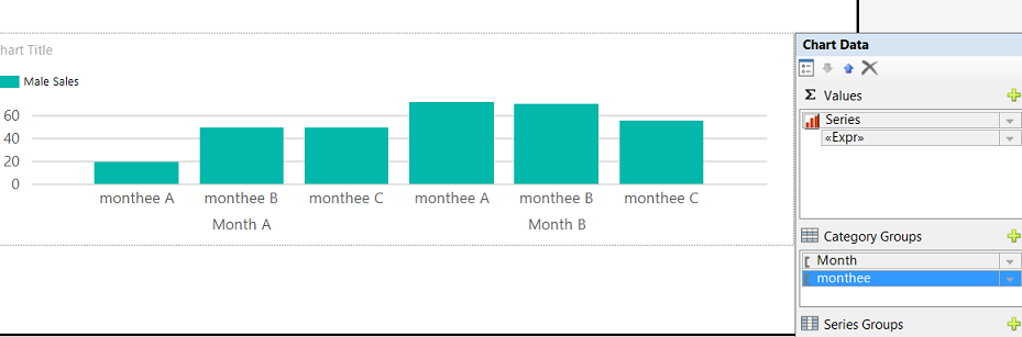
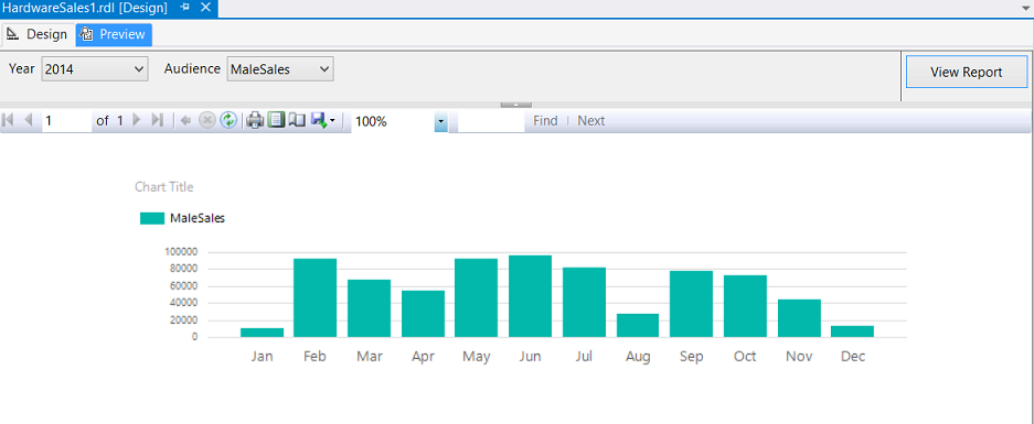
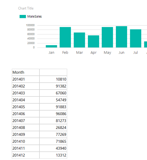
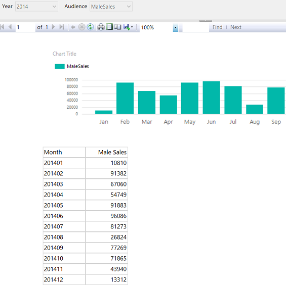
We shall be looking at “Sales By Employee Gender” report and examine step by step, how three reports may be combined into one single report. Our end version of the “Male Sales” is shown below:
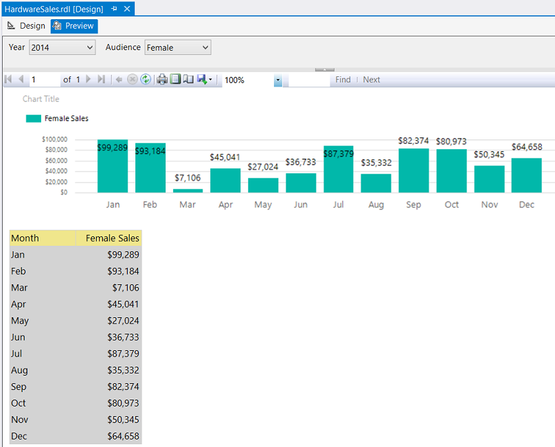
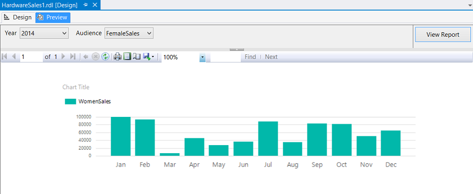
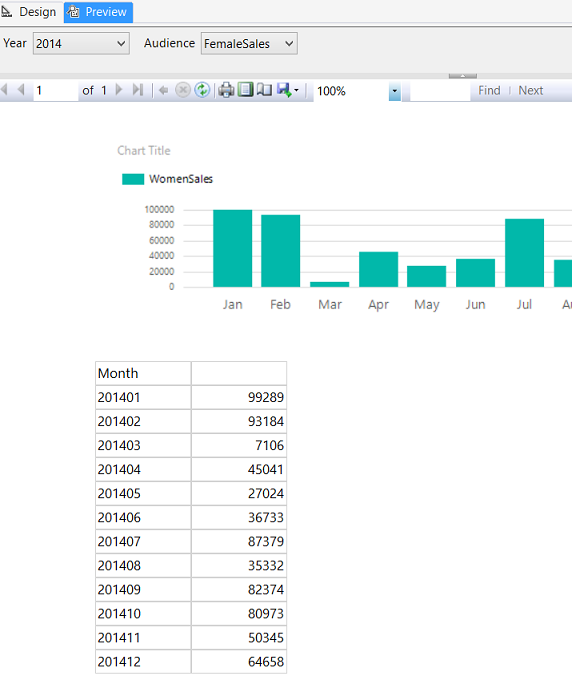
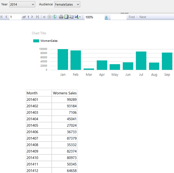
And the female version of the SAME PHYSICAL report is shown below:
Enough said, let us get started!
Getting Started
We begin our journey by having a quick look at Mary’s data.
Opening SQL Server Management Studio we open the SQL Shack database and have a look at an extract from the “HardwareSales” table (see below).
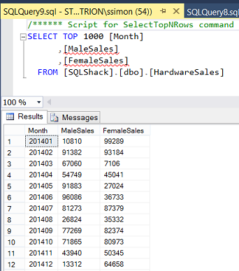
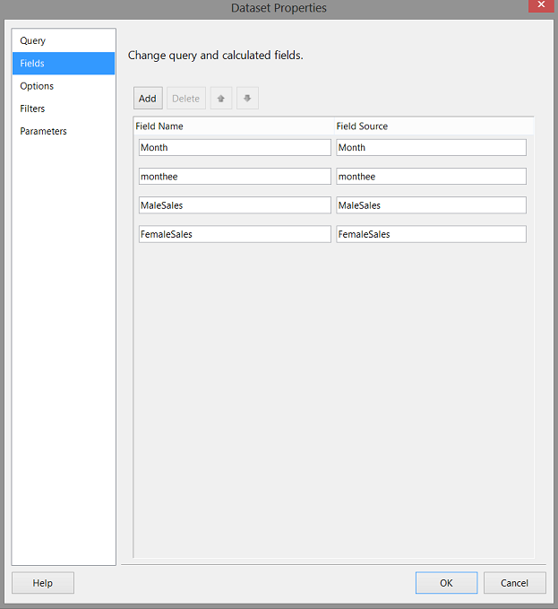
We note that Mary has a separate column for the Males Sales and one for the Female Sales, by Year and Month.
We begin by creating a small function that accepts a “Year Month” combination e.g. 201502 and calculates the first three letters of the month’s name. In this case “Feb”. The code for this function may be seen below in Addenda1.
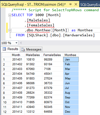
Our field containing the Month name “Monthee” (obtained from our function) may be seen above.
Having obtained the data that we require to construct Mary’s report, we now proceed to create a stored procedure that may be utilized to pull the necessary data for our Reporting Services report. The code for our stored procedure may be seen below:
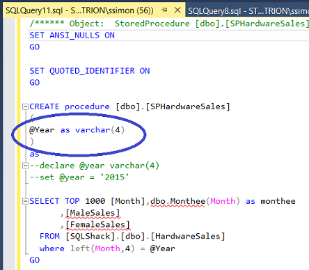
We note that when the stored procedure is called, that our report will pass a year value to the stored procedure.
Having reached this point, we are now ready to construct our report.
Creating our report
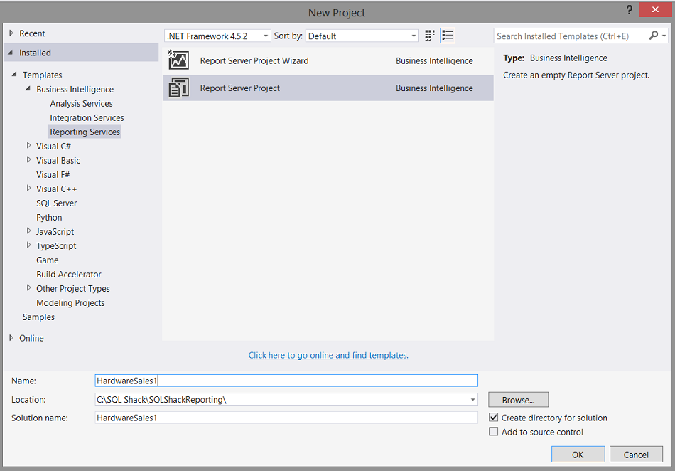
Opening Visual Studio 2015 or SQL Server Data Tools 2010 or greater, we open a new Reporting Services Project.
Should you have never worked with Reporting Services or should you not feel comfortable creating a Reporting Services project, then please do have a look at one of our earlier chats where the “creation” process is described in detail.
Beer and the tabular model DO go together
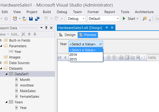
Having opened Visual Studio, we create our project and give it the name “HardwareSales1” (see below).
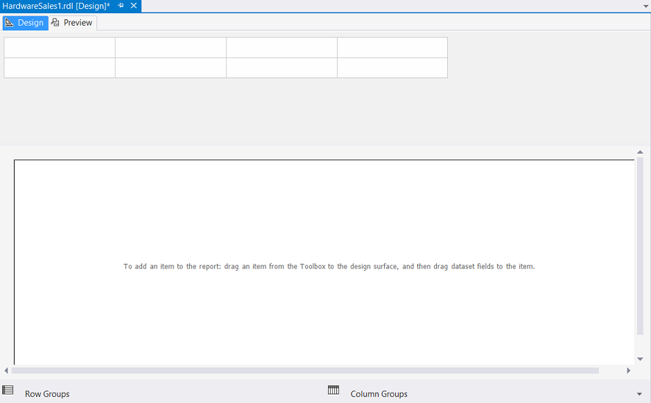
We find ourselves on our drawing surface (see below).
Our first task is to create a “Shared Data Source” which will connect to our relational database table. As we have discussed in past “get togethers”, the database may be likened to the water faucet on the side of your house. The “data source” may then be likened to a water hose that will carry the data to where it is required.
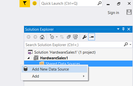
We “right click” on the “Shared Data Sources” tab and select “Add New Data Source” as shown above.
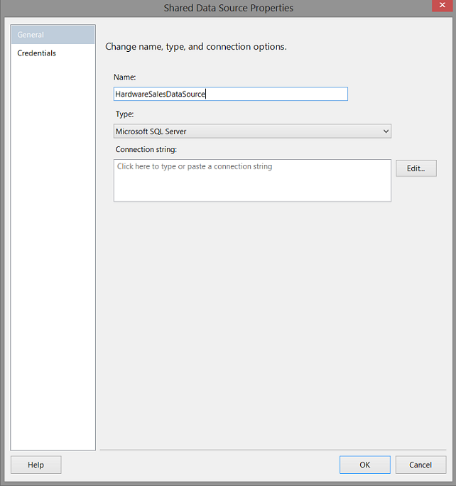
The “Shared Data Source” properties dialog box is brought into view (see above). We click “Edit” to create our “Connection string”.
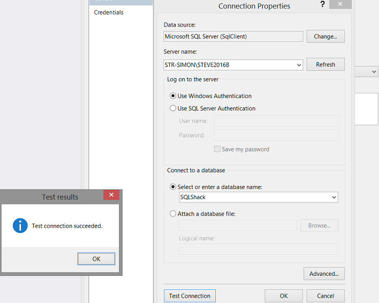
The “Connection Properties” dialogue box is brought up (see above).
We simply enter the name of the SQL Server and the name of the database where the data resides (see above).
We click “Ok” and “OK” again to completer the process. We find ourselves back upon our drawing surface (see below).
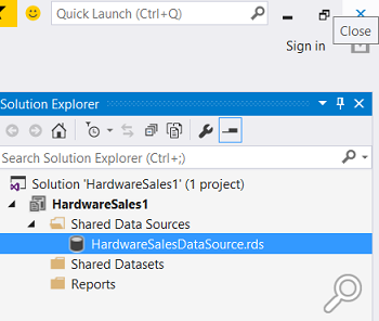
We note that the “Shared Data Source” that we just created is now present under the “Shared Data Sources” tab.
Our next step is to create a Report.
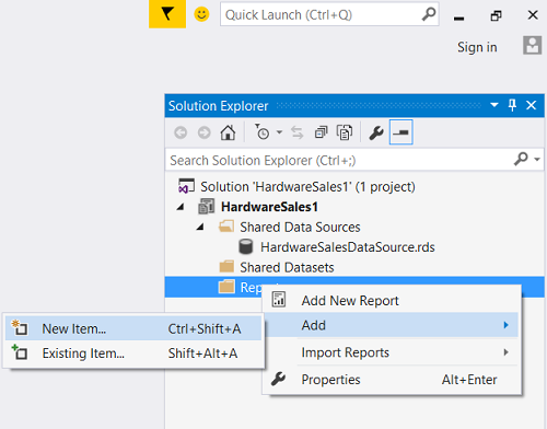
We “Right Click upon the “Reports” folder (see above) and we select “Add” and then “New Item”.
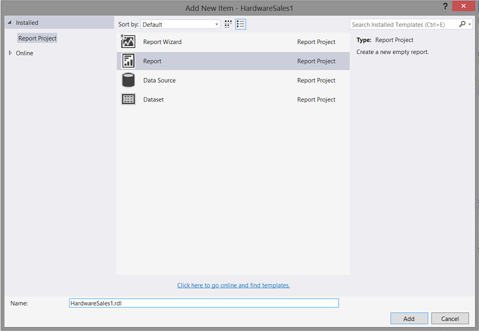
The “Add New Item” dialogue box appears. We select “Report” and give our report the name “HardwareSales1” (see above). We click “Add” to return to our drawing surface (see below).
Utilizing our hose and garden example. Having the water faucet (the database) connected to the Shared Data Source (the hose), we wish to be economical with our water and permit the hose to empty the water into a watering can. This “watering can” is our dataset and thus far it does not exist.
Let us create a “local “dataset.
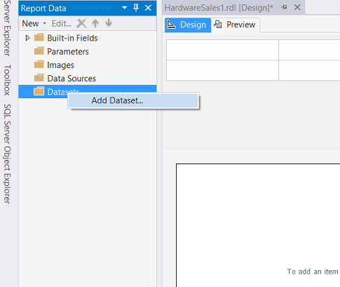
We right click upon the “Datasets” tab and select “Add Dataset” as may be seen above.
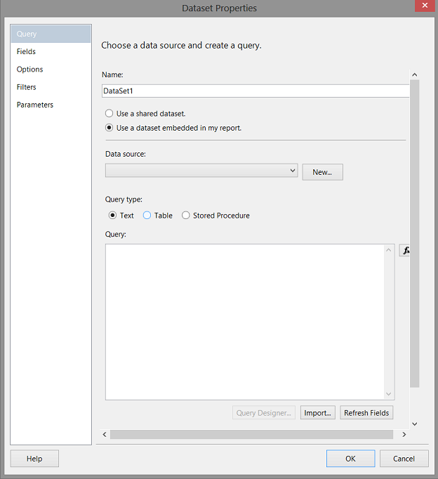
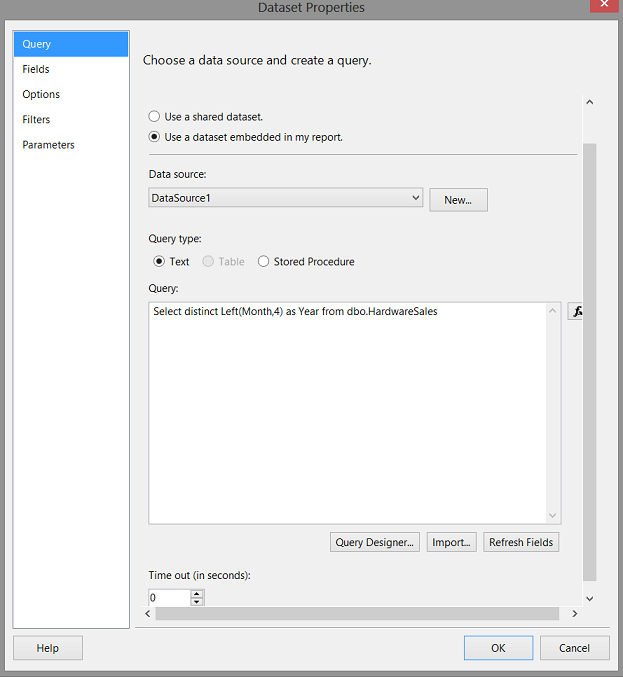
The “Dataset Properties” dialogue box is brought into view (see above). We select “Use a dataset embedded in my report”. We click the “New” button to create a “link” between this new dataset (that we are creating) and the stored procedure that we just created (see above).
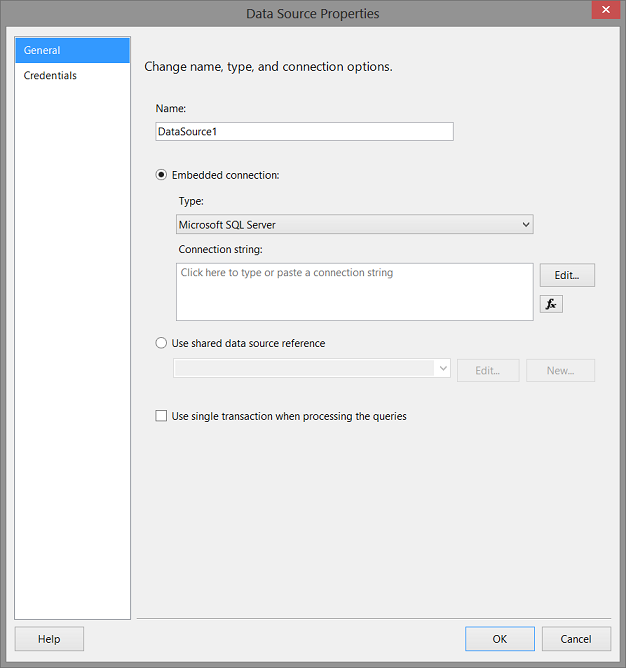
The “Data Source Properties” dialogue box appears (see above).
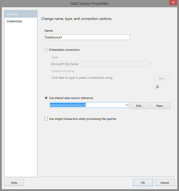
We select the “Use shared data source reference” option (see above). We click “OK” to exit this screen.
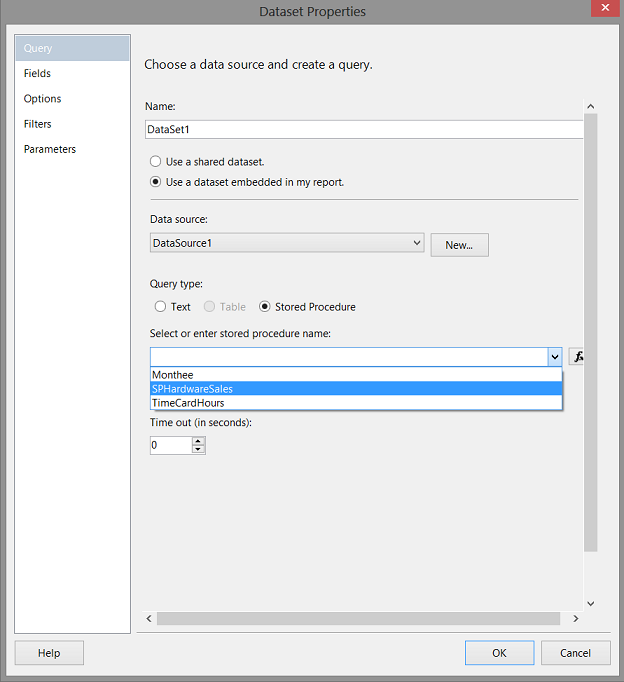
Returning to our “Dataset Properties” screen, we select our stored procedure (create above).
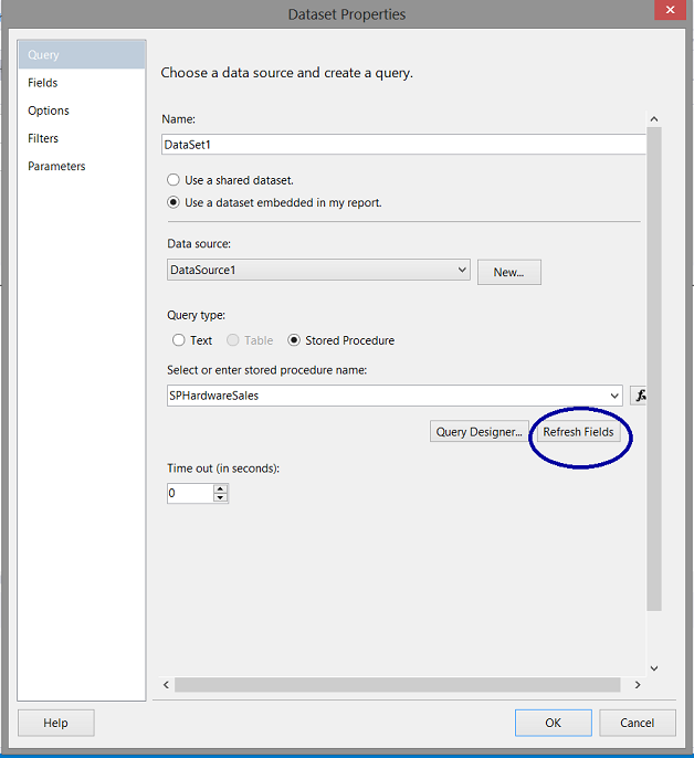
We click the “Refresh Fields” button which will pull the field names from the stored procedure and validate them (see below).
The fields appear in the screen dump above. Our last task in this step is to verify that “Reporting Services” has detected that we require a “Year” parameter to be passed to the stored procedure.
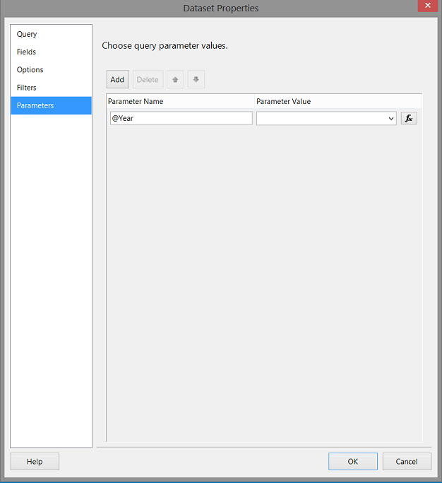
Clicking upon the “Parameters” tab, we note that the parameter “@Year” has been detected. In other words, Reporting Services has parsed the stored procedure and noted that the stored procedure is expecting a value of a year to be passed from the report to the query.
The astute reader will note that the value of the parameter is blank. Let us tend to this straight away. We click “OK” to leave this dialogue box and we find ourselves back upon our drawing surface.
Before creating our “Year” parameter, we must create one final dataset that pulls the unique values for the “years” contained within Mary’s data. The process is the same as we have described above. The final dataset layout may be seen below:
One final point, it must be remembered that the first four characters of the field “Month” contain the actual year.
Creating a “year” parameter
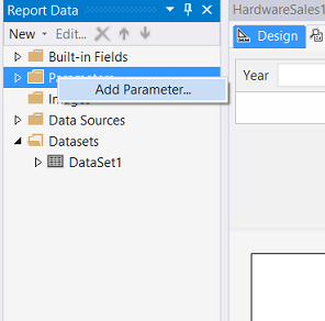
By “right clicking” on the “Parameters” tab, the “Add Parameter” option appears (see above). We click “Add Parameter”.
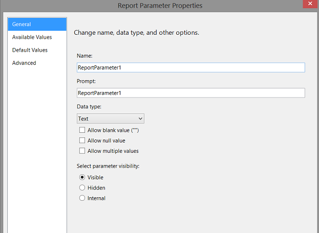
The “Report Parameter Properties” dialogue box appears (see above).
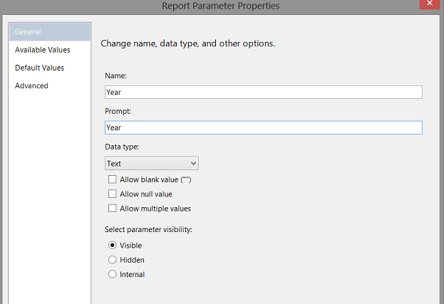
We give our parameter the name “Year” (see above). We now set our “Available Values” (see below).
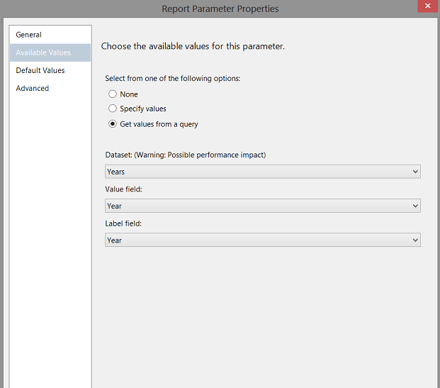
We inform Reporting Services that we shall be obtaining our “Year” arguments from the “Year” dataset that we created above. We click “OK” to leave the parameter box.
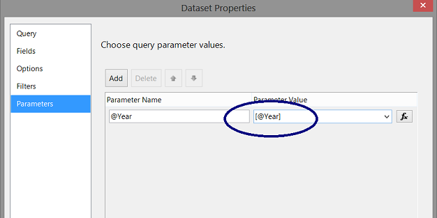
Now that we have our “Year” parameter created, we return briefly to our “DataSet1” dataset (which will contain our sales data), selecting the “Parameters” tab and modify the “Value” box to contain [@Year] (see below).
At this point if we run our report and have a quick look at our “Parameter” banner (see below), we note that “2014” and “2015” appear as report options (reflecting the actual years within Mary’s data).
We are now in the position where our report “Infrastructure” is complete. Now comes the tricky part.
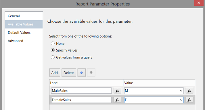
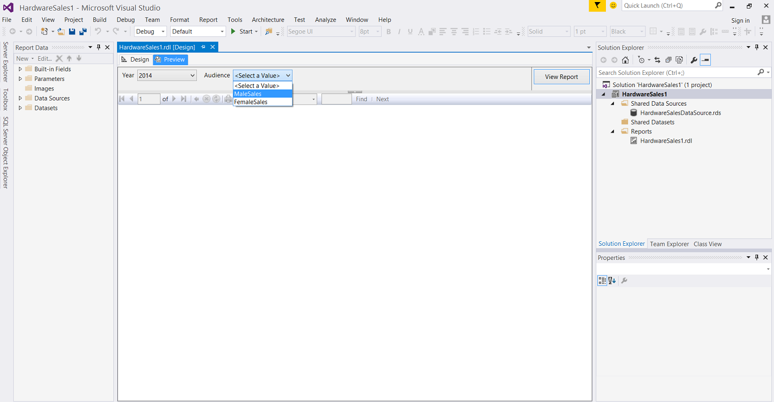
Our report which we are creating is gender-based and as such it is obvious that we have two unique values (i.e. M(ale) and F(emale). We create another parameter (Audience) the same manner described above, however, this time considering the nature of the parameter, I have “hard-wired” the values (see below).
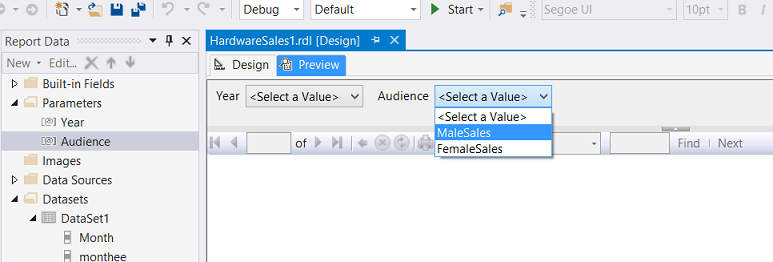
A quick re-run of our query will give us an idea of how the parameter selection will appear (see below).
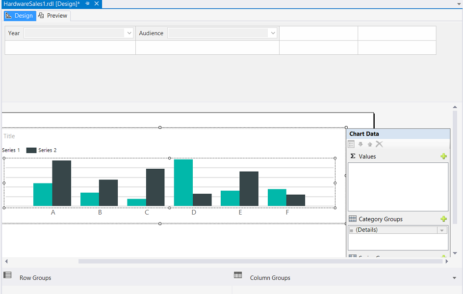
Creating our report chart
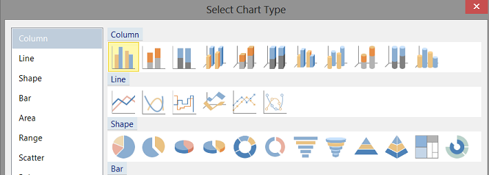
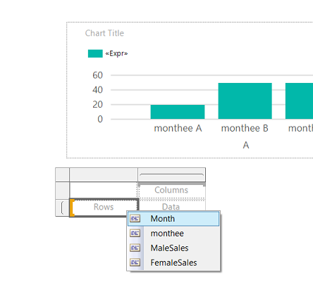
We begin by “dragging” a chart onto our work surface from the Reporting Services toolbox. We select a “Column” chart (see below).
We click “OK” to place the chart upon our drawing surface (see below).
Now that we have our chart on our drawing surface, we must inform the chart where it will obtain its source data and this is from the dataset (Dateset1) which will contain our sales data (see below).
By “Right Clicking upon our chart, the “Chart Data” dialogue box is displayed (see above). Under normal circumstances “Σ Values” box (see above) would contain either the “Male Sales” data or the “Women Sales” data.
Now hang on a bit, we could add both fields and be done with it, HOWEVER, we want this “fireside chat” to be a bit more innovative. Let us assume for the sake of argument that based upon which “Audience” the end user chooses, he or she wants that data displayed within one and only one report column! This is what we are going to implement.
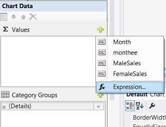
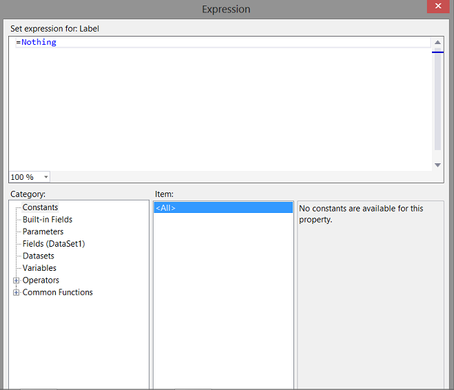
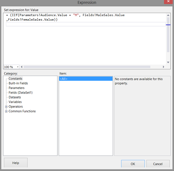
To configure our “Σ Values” box, we click the + and select expression (see above). The “Expression” dialogue box open (see below).
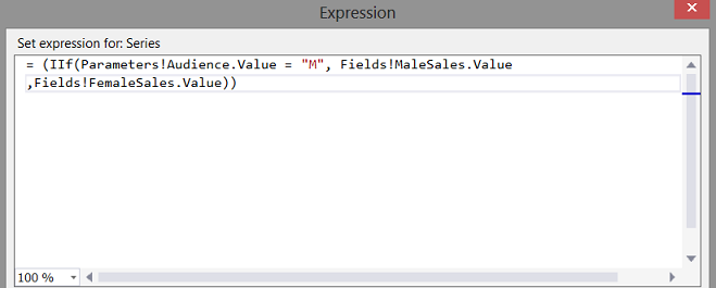
We enter the following expression into the “Expression” dialogue box.
= (IIf(Parameters!Audience.Value = “M”, Fields!MaleSales.Value
,Fields!FemaleSales.Value))
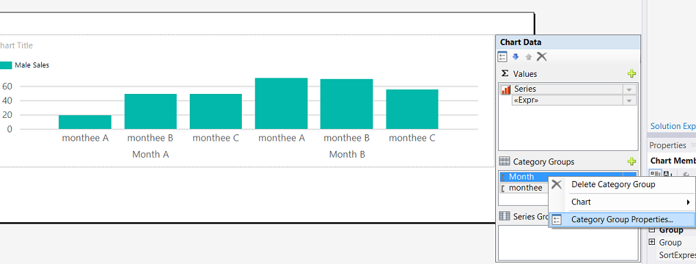
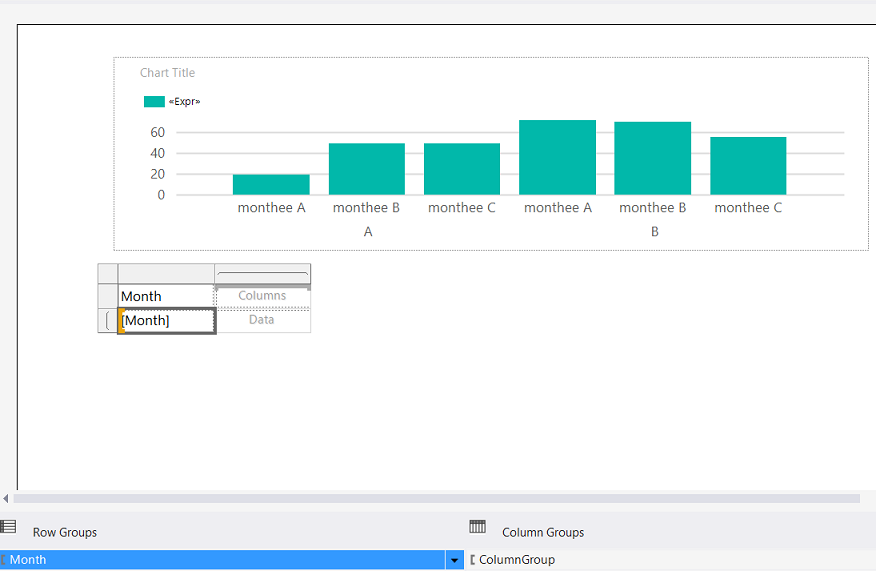
This done, our next step is to place the date-related fields (Month and Monthee) into the “Category Groups” (see below).
We now right-click on the Category Property of Month and select “Category Group Properties (see below).
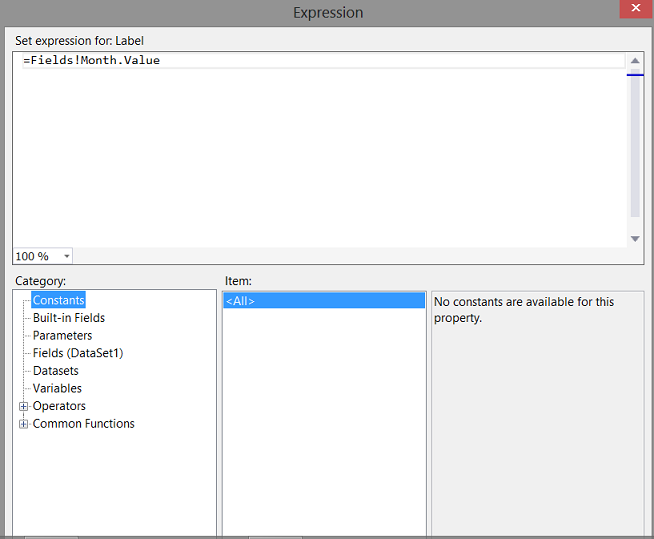
We open the “Expressions” tab next to the “Label” month and change the value in the expressions box (see below)
to
The reason we do this is that we do not want the year and the month to show up on the report. We rather want the actual month name to be reflected. The astute reader will note that the only reason that we utilized the year and month in the first place was to ensure that the month names appeared in the correct order and not from April to September (as would be alphabetical).
We have one last thing to do before applying the cosmetics to the report.
We must alter the horizontal axis to show every month.
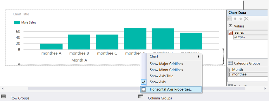
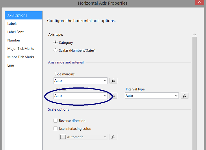
We right-click on the horizontal axis and select “Horizontal Axis Properties”(see above). The “Horizontal Axis Properties” dialog box opens (see below).
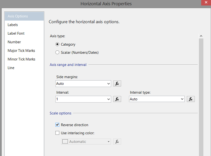
We change the inteval from “Auto” to 1 (see below).
We click “OK” to accept our changes and we are returned to our drawing surface.
Let us see what we have thus far
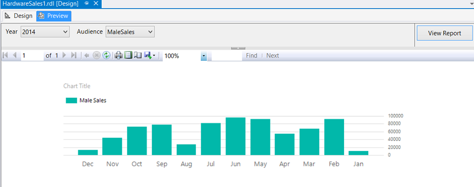
Clicking the “Preview” tab we set the “Year” to 2014 and we set the Audience to “MaleSales” and click “View Report”. The rendered report may be seen below.
Great!!! Now let us try “Women Sales”.
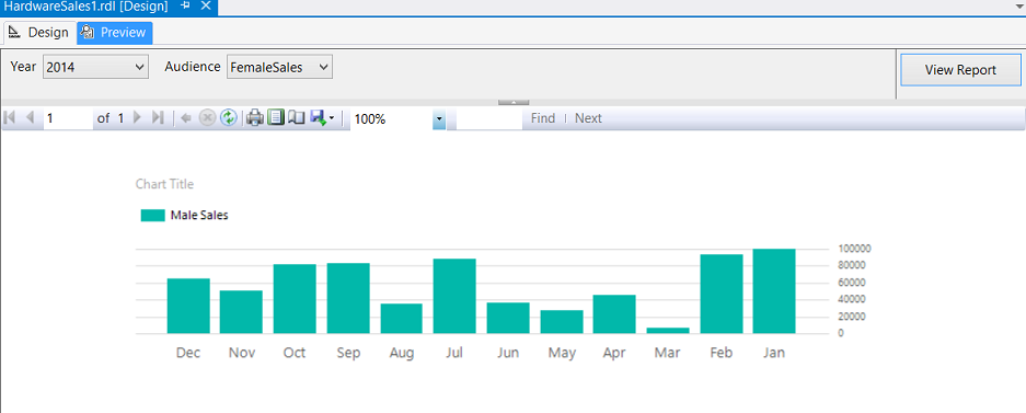
We can see that the report retains the same appearance however the financial details have changed. The only issue being that the legend still states “MaleSales”. Let us fix this.
We right click on the “Series” properties as may be seen below:
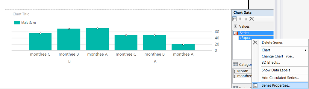
The “Series Property” dialogue box opens (see below).
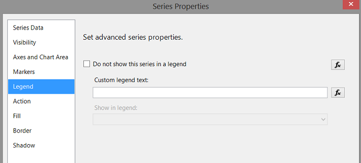
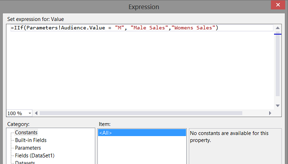
We click on the function tab to the side of the ”Custom legend text” label (see above).
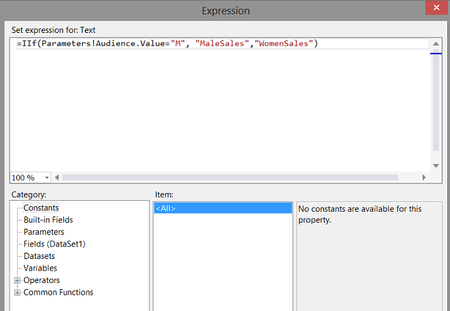
We enter the following expression within the dialog box.
=IIf(Parameters!Audience.Value=“M”, “MaleSales”,”WomenSales”)
We click “OK” to set the expression and return to our drawing surface.
Running our query once again we find that the label is now correct for “MaleSales”
The same is true for “Women Sales”
Adding a matrix
To improve our report, Mary had asked us to include a matrix so that she could easily see the dollar amounts.
We begin by dragging a matrix control from the toolbox to the drawing surface (and place it below the chart) see below.
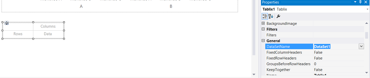
We set the “DataSetName” property to the same value that we utilized for the chart.
We set the first column to hold the year and month “Month”.
We note that the “Row Groups” is now set to the “year month” combination and this is exactly what we want.
We must remove the grouping on the “Column Groups”. We do so by right-clicking on the Value “Column Group” and selecting “Delete Group” (see below)
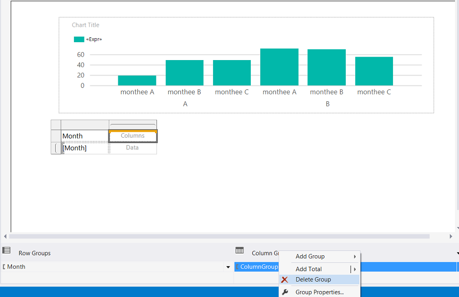
We are now asked if we want to delete just the grouping or the grouping and the data.
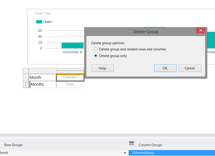
We select the “Delete group only” radio button (see above).
Now here is the grizzly part!
We would normally select a field such as “MaleSales” or “WomenSales” see below:
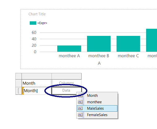
This would be the wrong answer for this exercise. What we need to do is to right click on the text box (see above) and select “Textbox Properties” (see below).
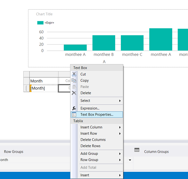
The “Textbox Properties” dialogue box opens.
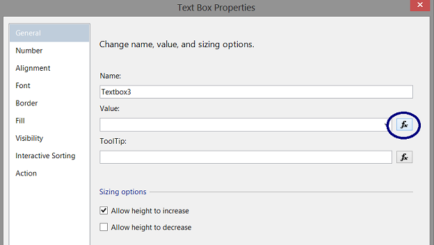
We open the function box to for the “Value” box and add the same code that we utilized for the chart.
= (IIf(Parameters!Audience.Value = “M”, Fields!MaleSales.Value
,Fields!FemaleSales.Value))
The code (above) having been placed in the Expression dialogue box. We click “OK” to accept.
Running our report for “MaleSales” we obtain the following (see above) and
“WomensSales” may be seen above.
Let us fix the glaring issue. Our column containing the sales has no title.
Once again, we open the properties box HOWEVER this time for the column header and for its “Value” we enter the following code within the expression box.
This code will enable us to have the correct column header above the financial figures.
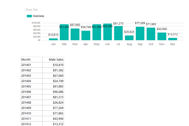
Running our report once again, we find for “Male Sales”…
and for “Women Sales”
Applying the “bangers and whistles”
While the necessary information is contained in our report, the final task that we have is to tidy the report format. We shall format the vertical axis of the chart to reflect “$” (in addition to $’s within the matrix). We shall place value labels on the bar chart as well (see below).
Should you be unfamiliar with formatting charts and matrices, do have a look at one of my earlier SQL Shack articles where the complete process is described in detail. Failing that, do feel free to contact me via SQL Shack. I promise I do answer all questions (if I can).
So we now come to the end of another “get together”. I hope that this article has given you some food for thought.
Conclusions
Report real estate is often limited and we all attempt to overload our reports, primarily due to end-user requirements. This is often a challenge. This said, with a bit of ingenuity we can have all the user required information yet manage to maintain some semblance of order upon our drawing surface. Whilst what we discussed today is rather simplistic, there are a plethora of other ways of controlling information visibility lying at your fingertips.
As always, should you have any questions, please do contact me.
In the interim, happy programming!
Addenda 1
|
1 2 3 4 5 6 7 8 9 10 11 12 13 14 15 16 17 18 19 20 21 22 23 24 25 26 27 28 29 30 31 32 33 34 35 36 37 38 39 |
USE [SQLShack] GO SET ANSI_NULLS ON GO SET QUOTED_IDENTIFIER ON GO create function [dbo].[Monthee] ( @YearMth as varchar(6) ) RETURNS Varchar(6) AS BEGIN declare @Return varchar(6) Begin Set @return = case when right(@YearMth,2) = '01' then 'Jan' when right(@YearMth,2) = '02' then 'Feb' when right(@YearMth,2) = '03' then 'Mar' when right(@YearMth,2) = '04' then 'Apr' when right(@YearMth,2) = '05' then 'May' when right(@YearMth,2) = '06' then 'Jun' when right(@YearMth,2) = '07' then 'Jul' when right(@YearMth,2) = '08' then 'Aug' when right(@YearMth,2) = '09' then 'Sep' when right(@YearMth,2) = '10' then 'Oct' when right(@YearMth,2) = '11' then 'Nov' when right(@YearMth,2) = '12' then 'Dec' else 'XXX' end end RETURN(@return) end GO |
References:
- Expression Examples (Report Builder and SSRS)
- Expressions (Report Builder and SSRS)
- Formatting a Chart (Report Builder and SSRS)
- Lesson 5: Formatting a Report (Reporting Services)
Steve has presented papers at 8 PASS Summits and one at PASS Europe 2009 and 2010. He has recently presented a Master Data Services presentation at the PASS Amsterdam Rally.
Steve has presented 5 papers at the Information Builders' Summits. He is a PASS regional mentor.
View all posts by Steve Simon
- Reporting in SQL Server – Using calculated Expressions within reports - December 19, 2016
- How to use Expressions within SQL Server Reporting Services to create efficient reports - December 9, 2016
- How to use SQL Server Data Quality Services to ensure the correct aggregation of data - November 9, 2016