
Introduction
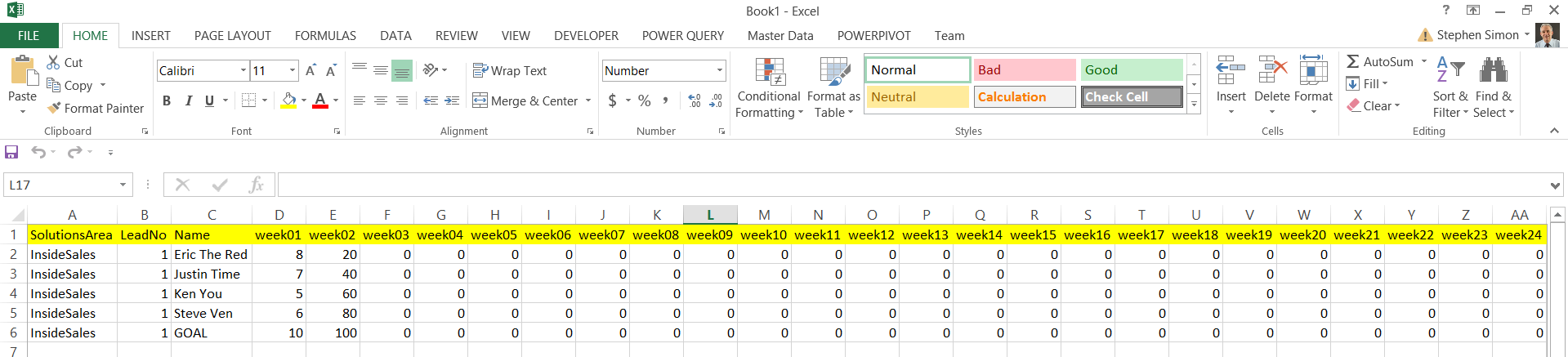
Oft times we are forced into situations where we must clearly think outside of the box. In today’s “get together”, we are going to discuss a challenge that I encountered during the last week of February of this year. The client had been charting weekly business calls placed by his sales reps. Our client had been tracking these results within an Excel spreadsheet (see the screen dump below) and he would be using this spreadsheet to report the sales reps progress going forward. My task was to source this data for the corporate reports in Reporting Services, from this spreadsheet and do so on a weekly basis. The client, being resistant to change, was not willing to change the format of the spreadsheet to something more conducive to be utilized by the chart that he wished to produce (see immediately below).
Another challenge was the efficient and effective usage of the report real estate. After having produced the POC, we soon realized that a full plot of 52 weeks would not be a viable option due to the vast amount of data and employees to be represented in such a small area. At the end of the day, we opted to show the current quarter’s data based upon logic placed within the query code which would determine the current quarter, calculated at runtime.
A sample of the finished chart may be seen above, whilst the format of the raw data from the user’s spreadsheet may be seen below:
All said and done, the data had to be pivoted and this is our challenge for today’s chat.
Getting started
Creating our load from the users spreadsheet to the staging table
Opening SQL Server Data Tools we create a new Integration Services project.
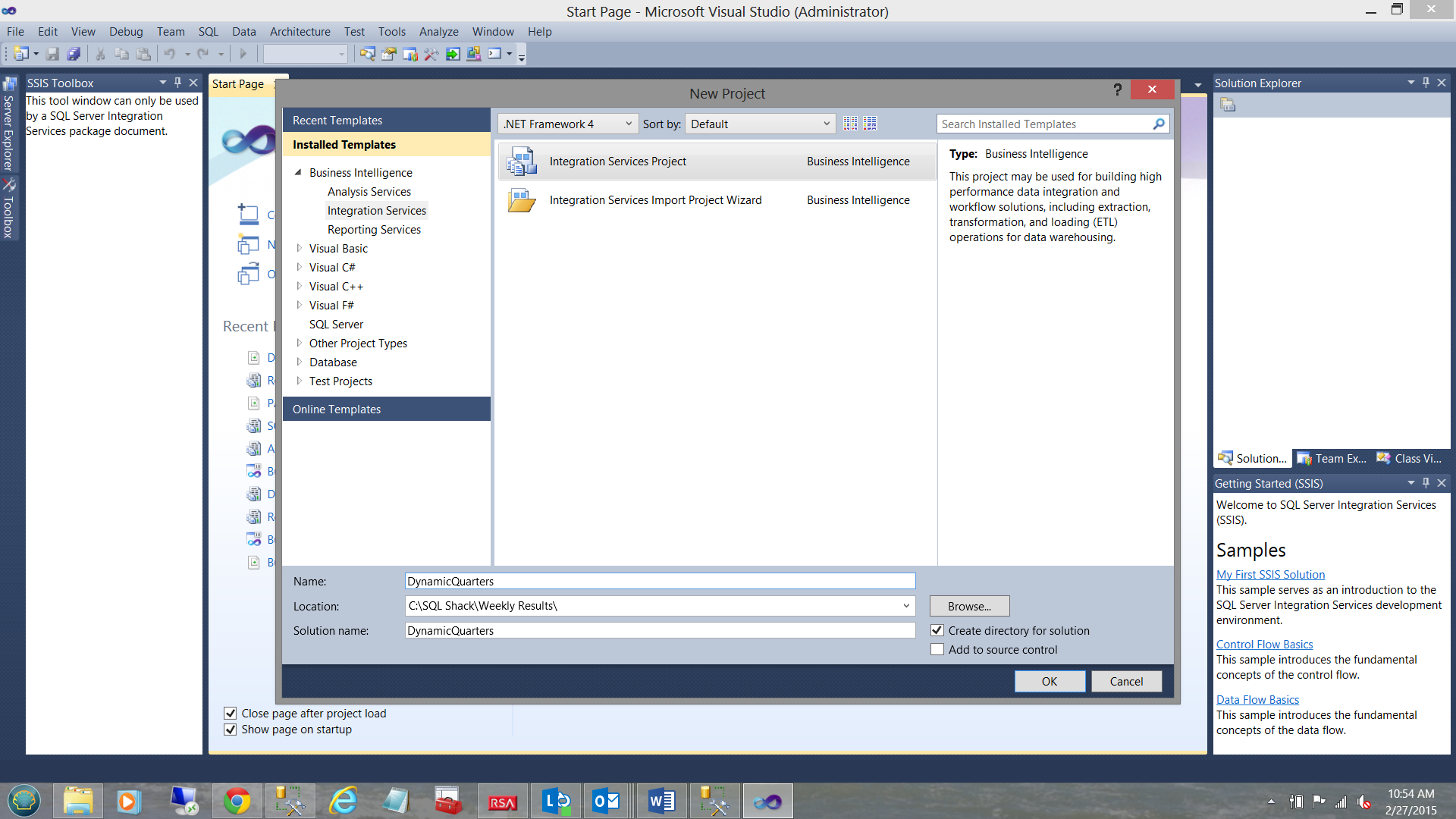
We give our project a name and click OK to create the project (see above).
Should you be unfamiliar with creating projects within SQL Server Data Tools do have a look at one of my other articles on SQL Shack.
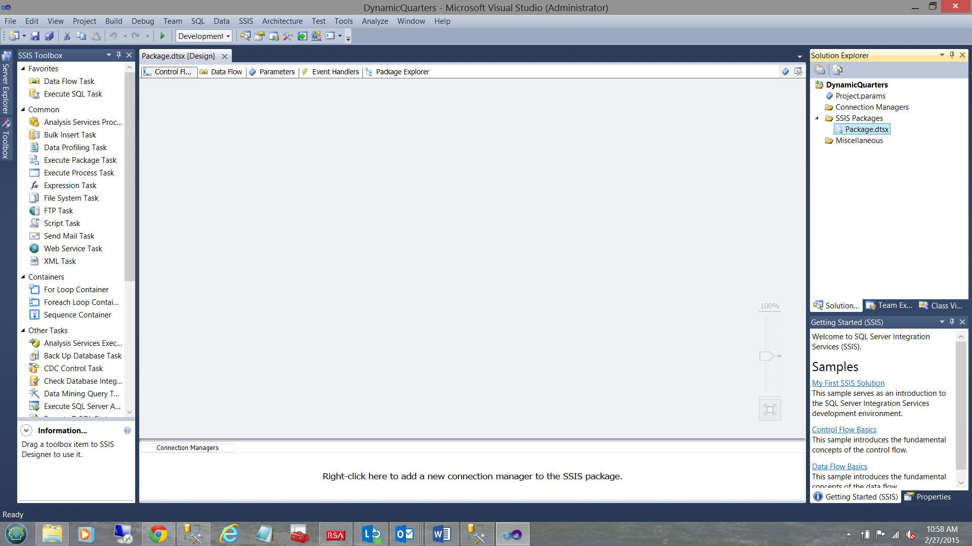
We find ourselves on our working surface.
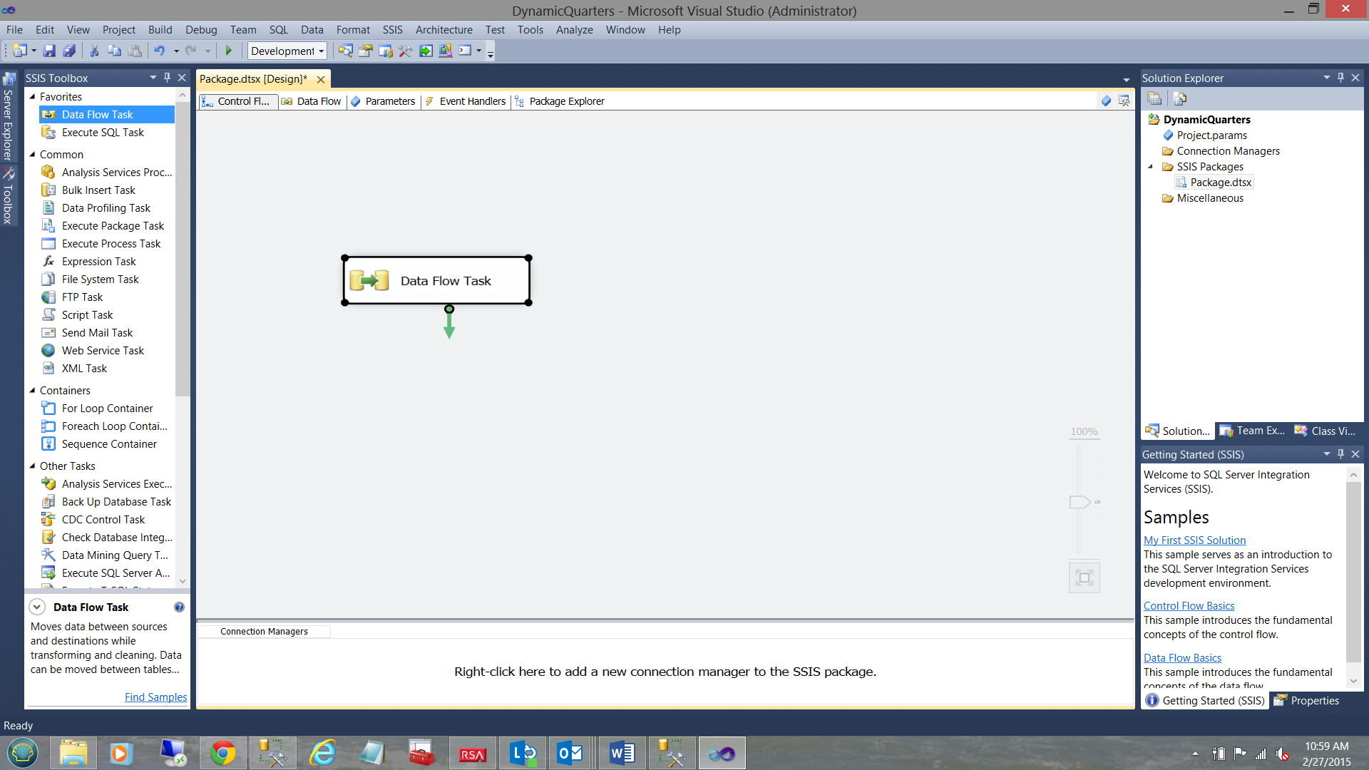
We drag a “Data Flow Task” on to our work surface as may be seen above.

Double-clicking on the “Data Flow Task” brings us to our “Data Flow Task” work surface.
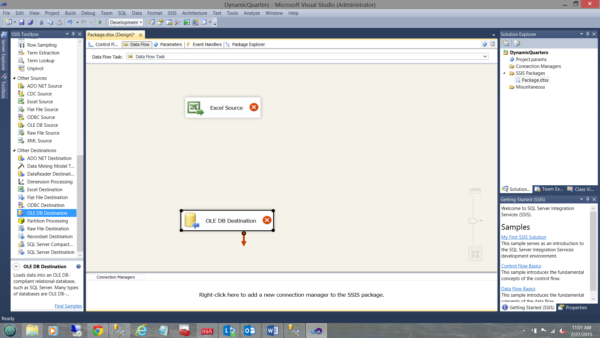
We now drag an “Excel Source” onto the work surface, in addition to an “Ole DB Destination”.
We may now configure the “Excel Source”.
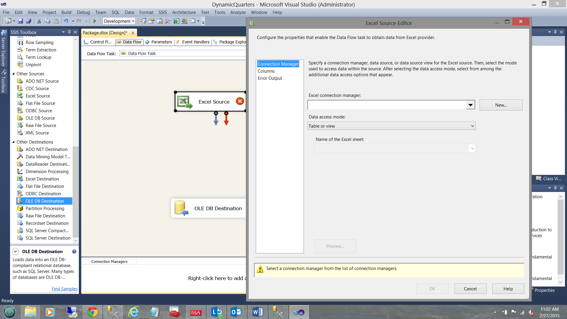
By double-clicking on the “Excel Source” the “Excel Source Editor” is brought into view. We click the “New” button (see above).
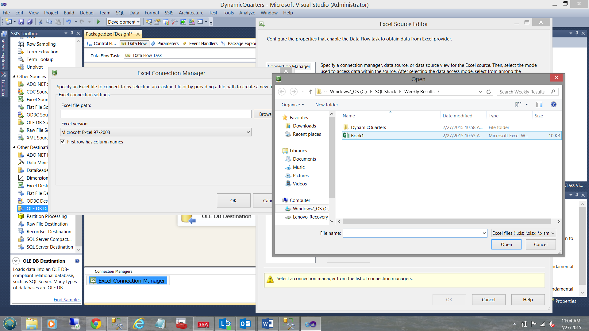
The “Excel Connection Manager” is now visible and we select the ‘Browse” button to look for our source data spreadsheet “Book1” (see above). We select “Book1” and click “Open”.
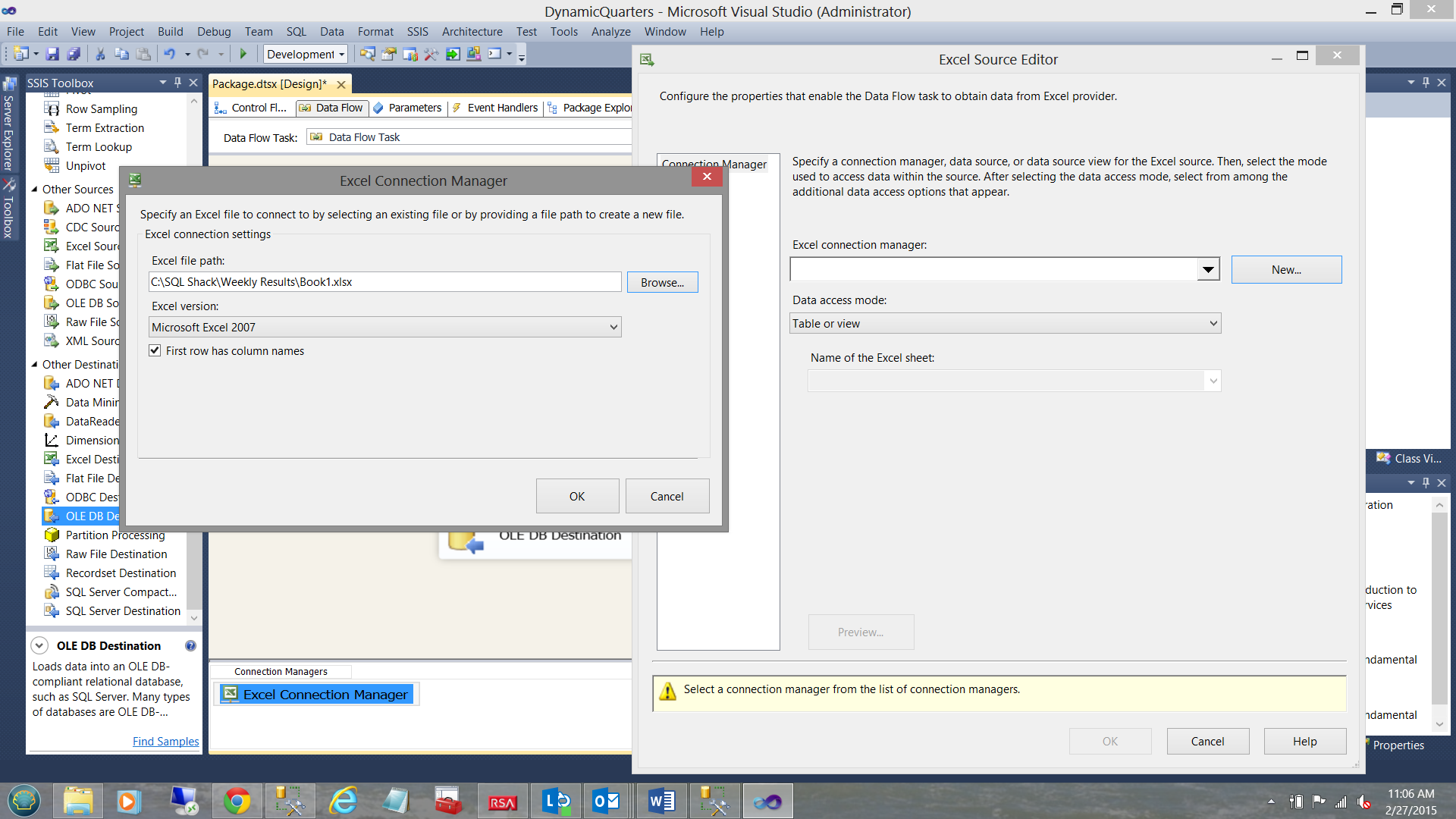
The reader will note that the spreadsheet name is visible in the “Excel Connection Manager” dialog box (see above). We click OK to leave this dialog box.
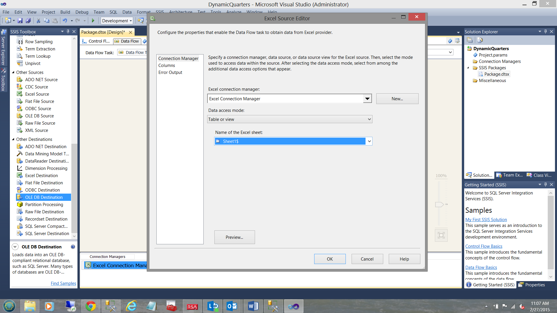
We find ourselves back in the “Excel Source Editor”. We select “Sheet1$” from the “Name of the Excel sheet” dialog box (see above).
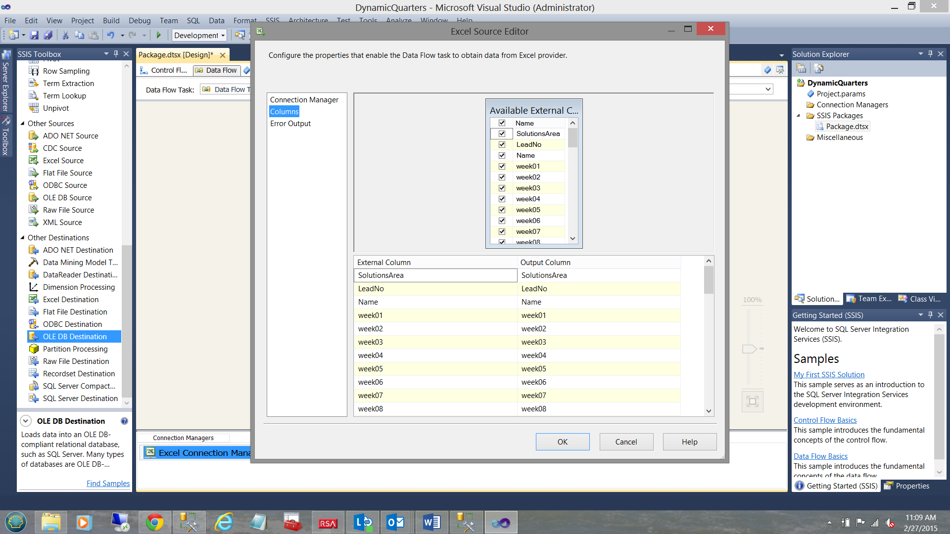
Clicking the “Columns” tab, we see the columns that are present within the spreadsheet. We click “OK” to accept what we have (see above).
This achieved, we must now configure our data destination. This will be a table within the SQL Shack Financial database.
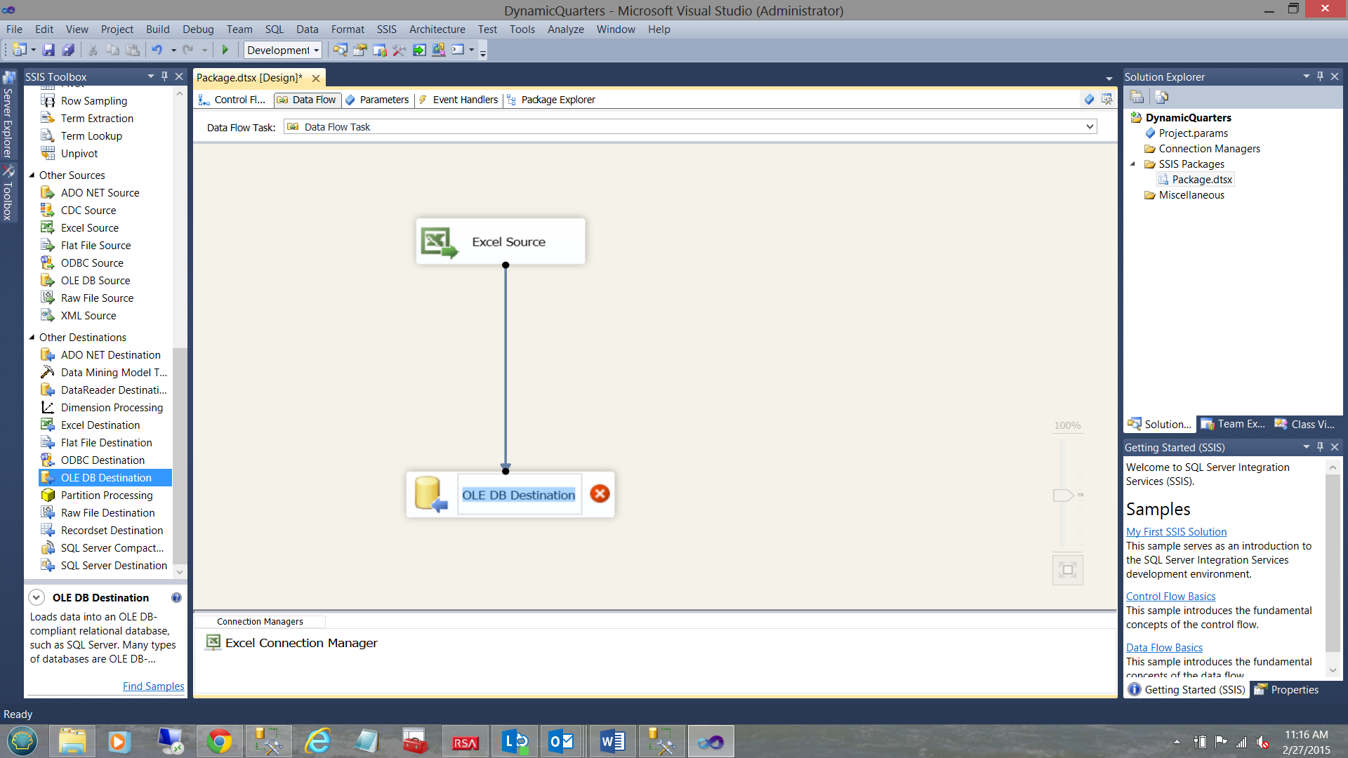
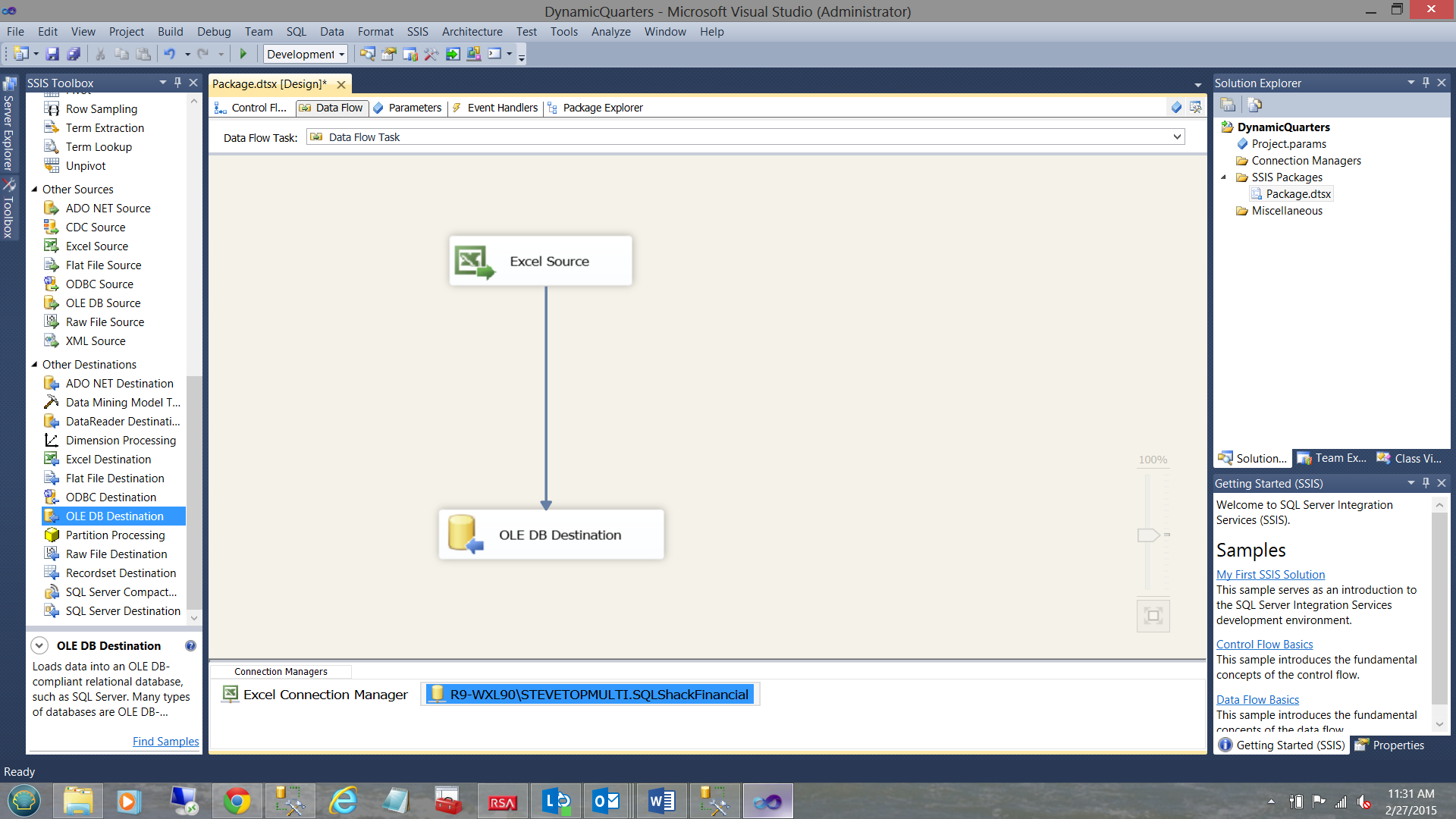
We first join the “Excel Source” to the “OLE DB Destination” (see above).
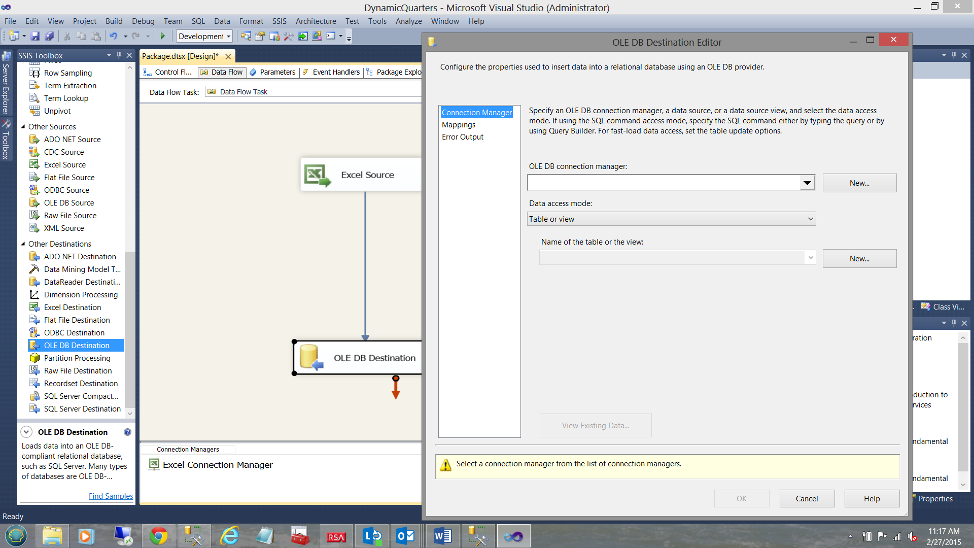
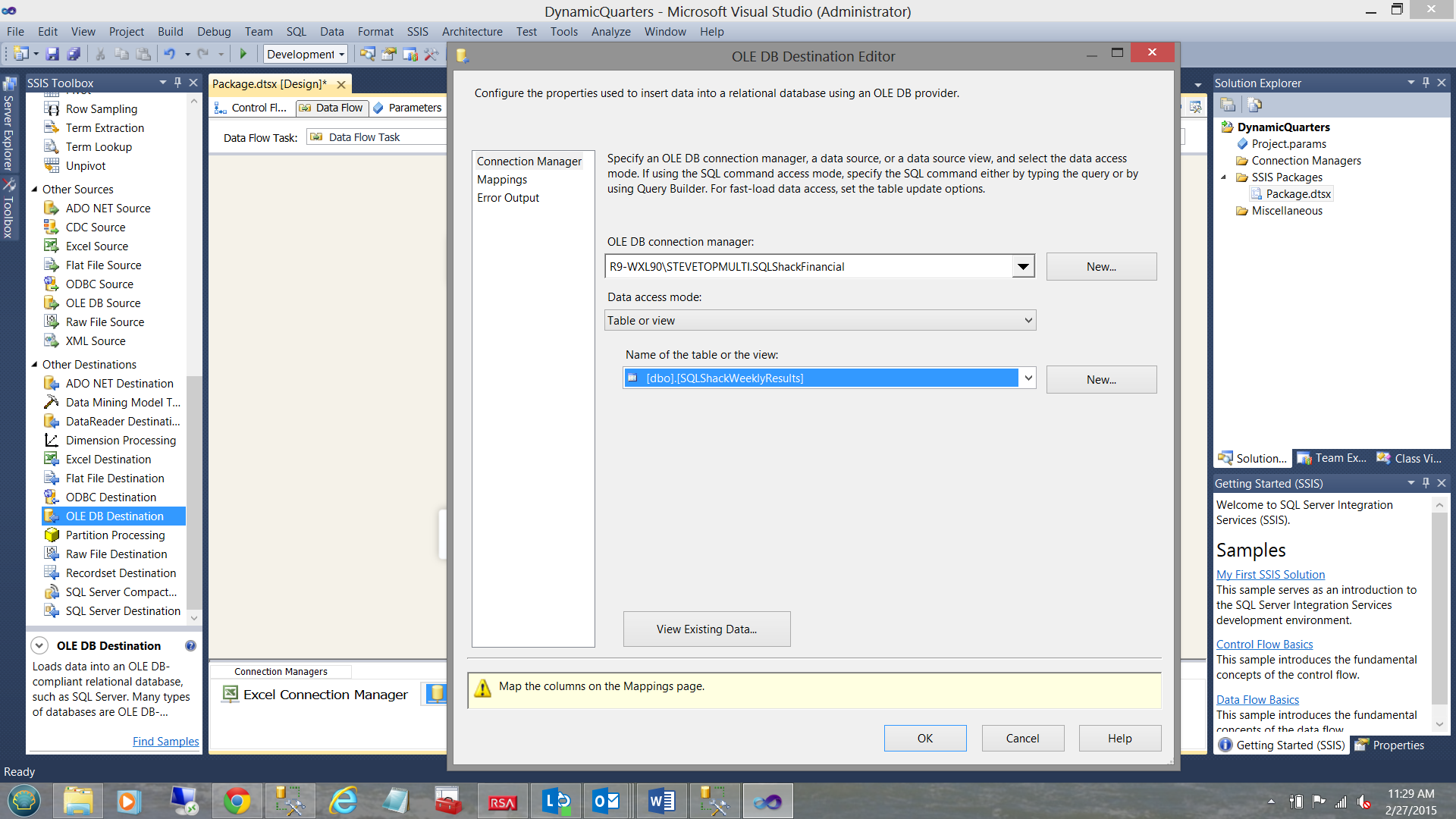
Once again, double-clicking on the “OLE DB Destination”, brings up the Editor (see above).
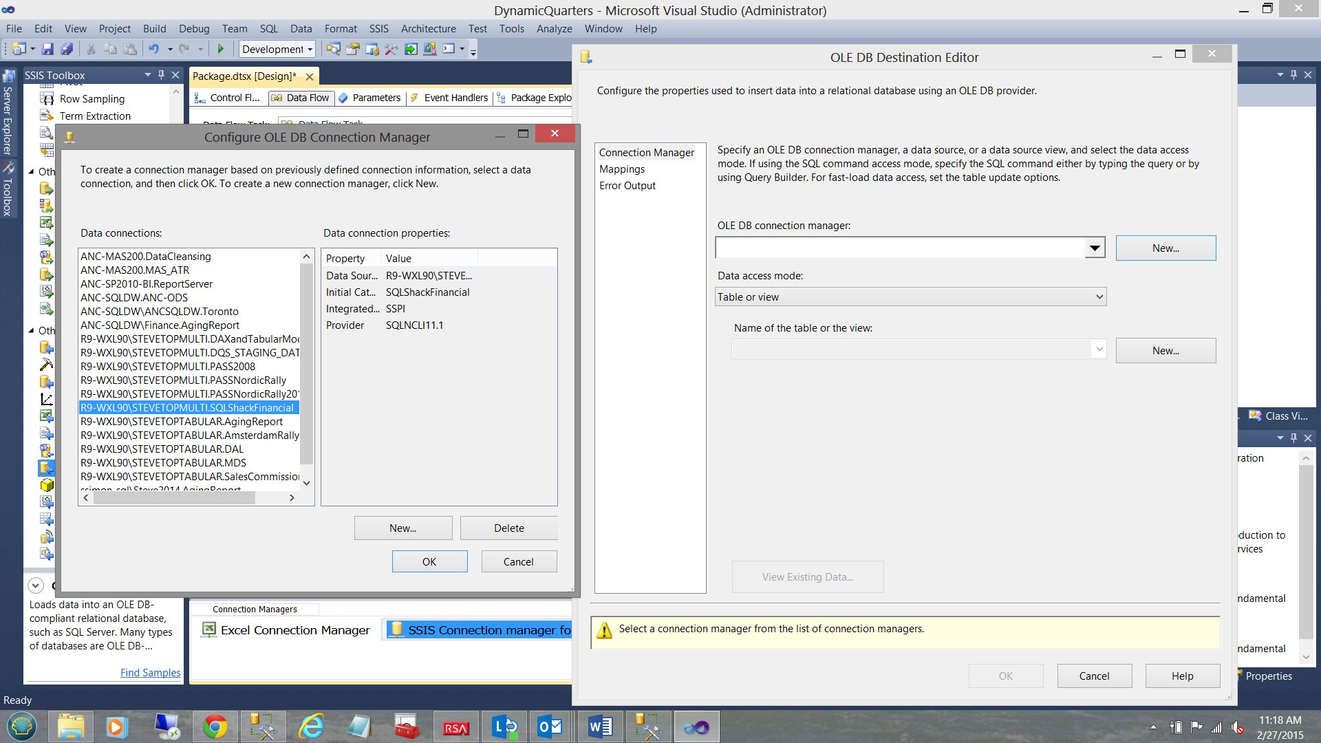
We select the “New” option by clicking the “New” button to the right of the “OLE DB connection manager” drop-down box. The “Configure OLE DB Connection Manager” dialog box is brought into view. We select the SQL Shack Financial database as may be seen highlighted above and to the left. We click “OK” to leave the “Configure OLE DB Connection Manager” dialog box and we find ourselves back in the “OLE DB Destination Editor” (see below).
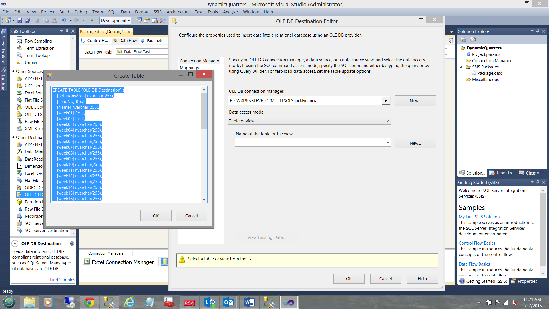
We must now create our destination table within the “SQLShackFinancial” database. We click “New” beside the “Name of the table or the view” drop-down box (see above). The “Create Table” box is brought into view. The astute reader will note that a proposed table definition is shown (see above and to the left). We shall change the proposed table name from “OLE DB Destination” to “SQLShackWeeklyResults”. We click “OK” to leave this dialogue box. The important point to remember is that when we do click “OK”, the physical table is then created within the database.
The table having been created, we now are able to place that table name into the “Name of the table or the view” drop down box (see below).
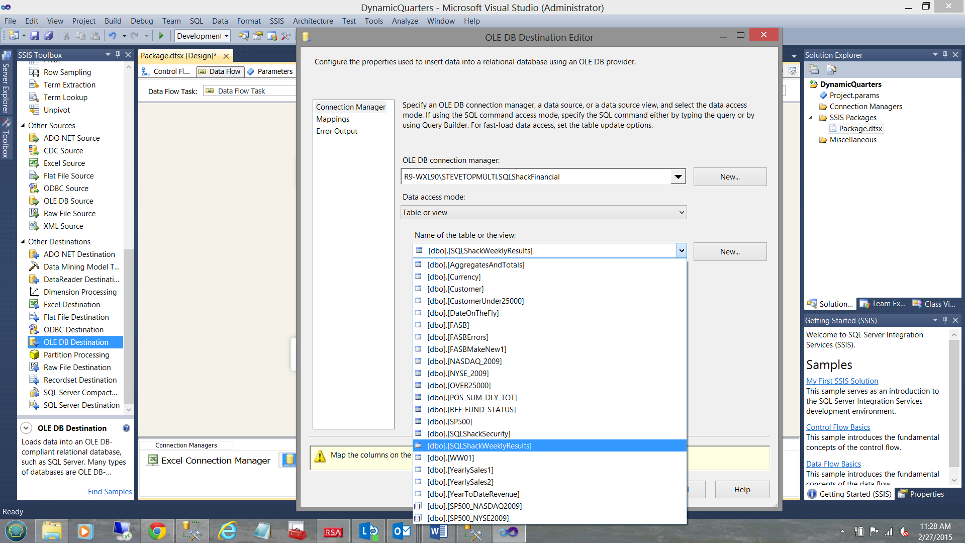
We select the table name (see above).
Once again, we are returned to our “OLE DB Destination Editor” (see above).
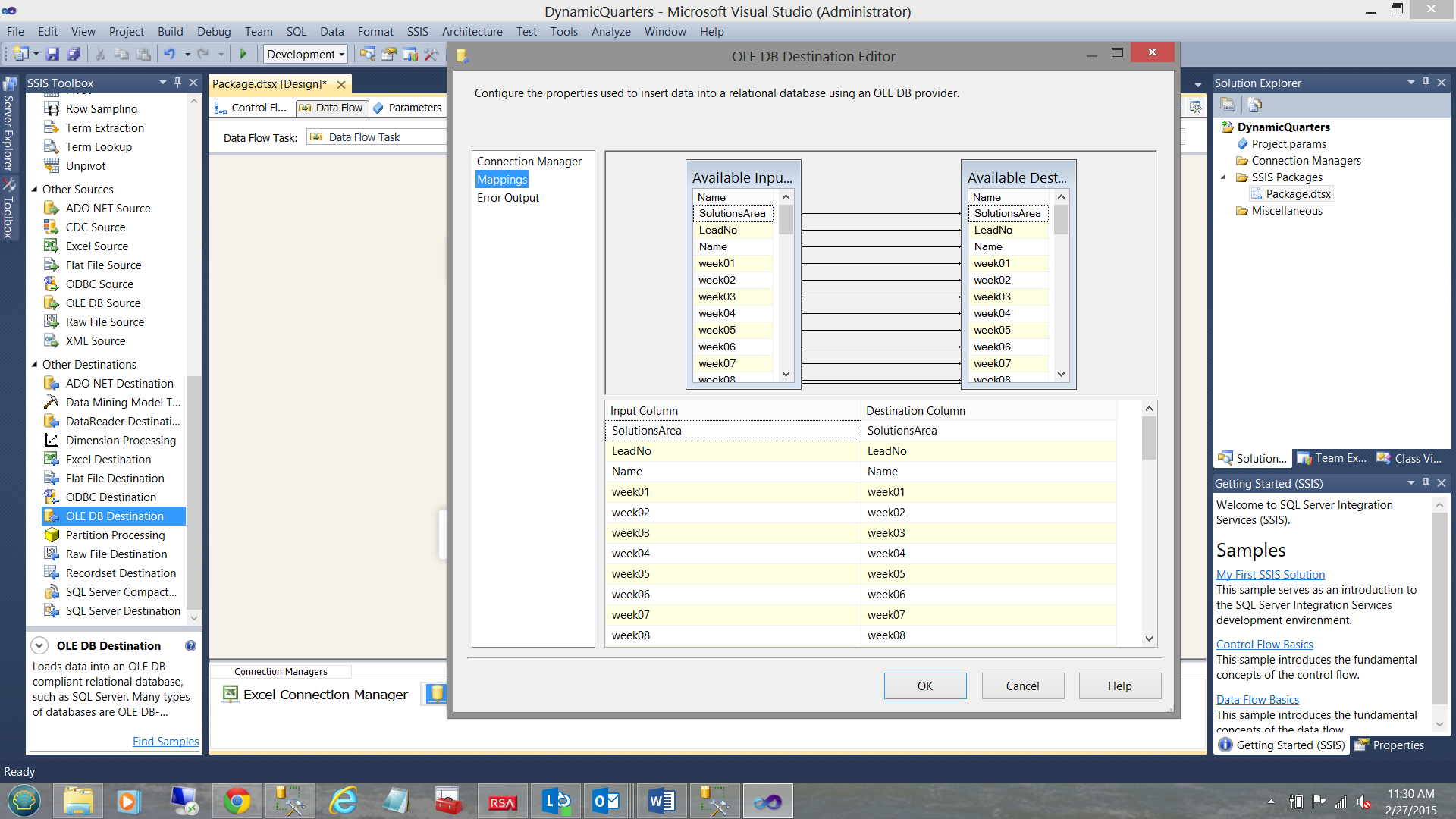
Clicking the “Mappings” tab (see above) we note the one to one mapping of the fields in the source Excel spreadsheet to the fields within the database table (see above).
We click “OK to leave the dialog box and find ourselves back on the drawing surface.
Loading the data
All that remains is to load our raw data from the spreadsheet that the client maintains, into our database table.
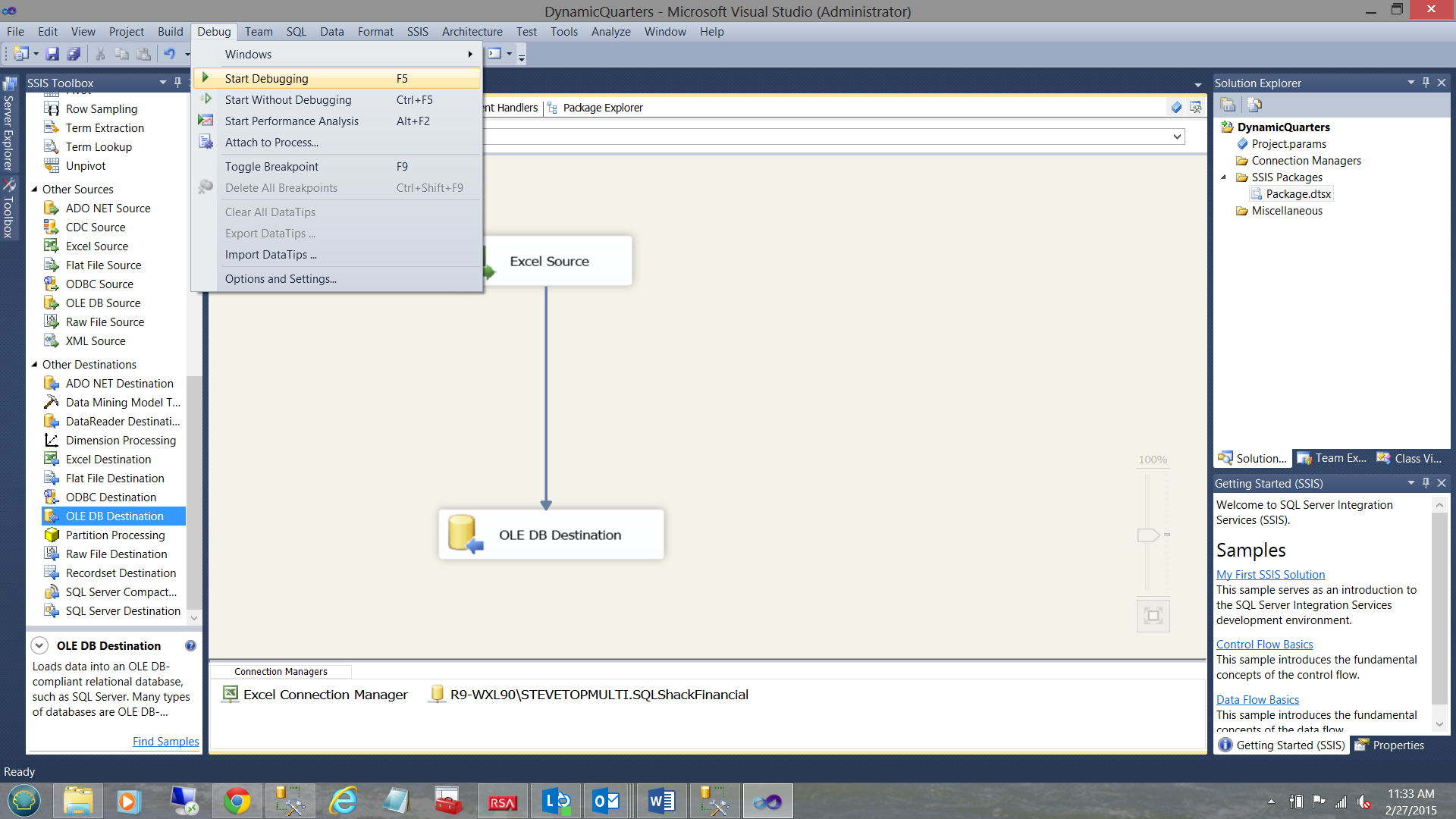
We do so by clicking the “Debug” tab (as we are running the package manually). Normally the load would be scheduled utilizing the SQL Server Agent.
The big GOTCHA!!!
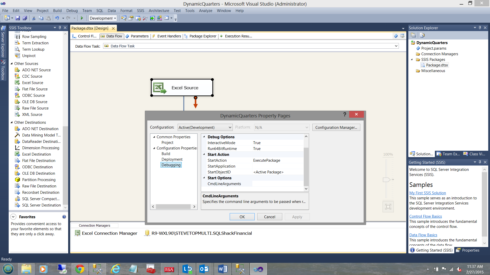
Should you be running a 32-bit installation, then the load WILL FAIL with the ugliest error message. We must first change the “Debug Option” property “Run64BitRunTime” from true to False (see above).
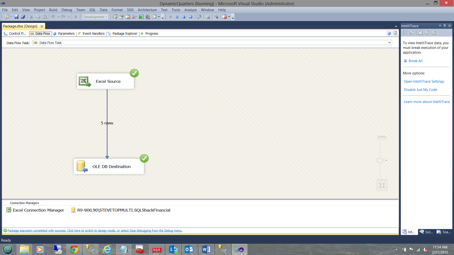
Clicking the “Debug” option and “Start Debugging” we are able to load our data into the table (see above).
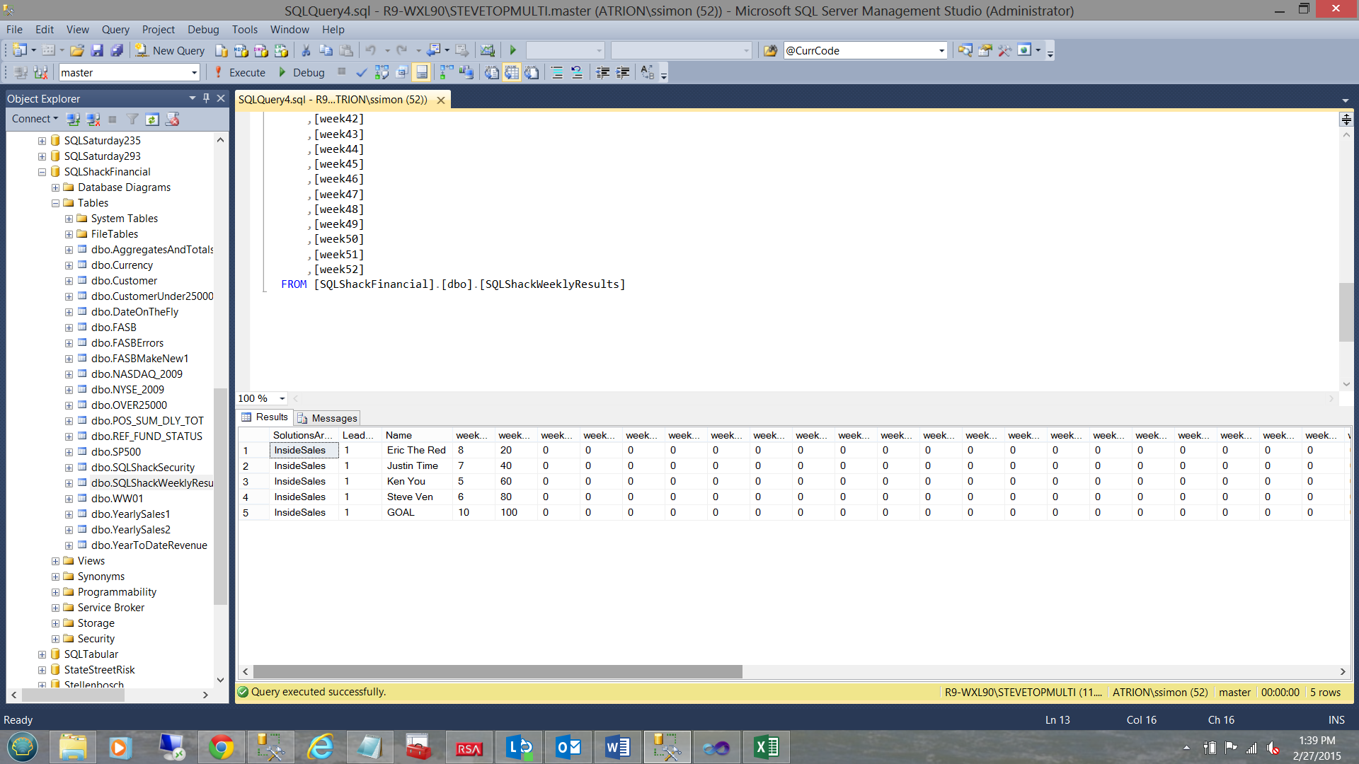
Looking at the table that we just populated within our database, we find the following (see above).
Getting to the meat on the bone
With the data present within the database table we are now in a position to craft our T-SQL query. The complete code listing may be found in Addenda 1.
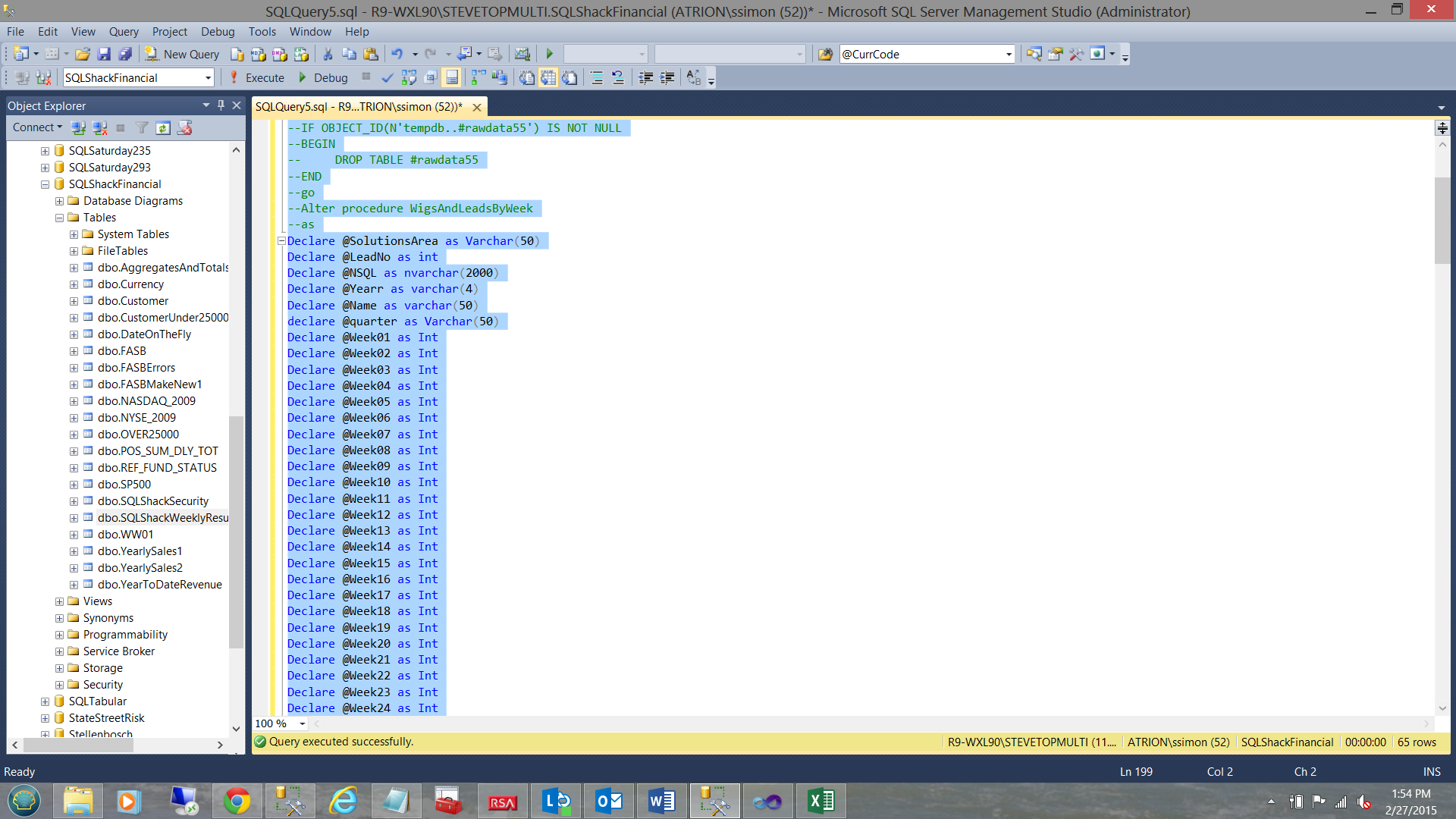
We begin by declaring a few variable. The reader will note that there wads of these variables and this was the most efficient however not the most effective manner in which to create the query. The total record volume would be under 10,000 and that said, including time deadlines, I opted for the “good ole quick and dirty”.
Once again I have spent many years working with Oracle (which is cursor based). Although we hate these ‘animals’ there are times when they do come in handy. When your data resides in a temporary table and there is little to no chance of locking production tables, I am of the opinion that there is little risk.
Having declared all the necessary variables and having my data available to me, I declare a table variable called “Weekly Values”. The table variable will contain:
- The clients workgroup name (e.g. Inside Sales)
- The lead number (an ordinary integer and not really relevant to our discussion)
- The name of the employee (e.g. Steve Ven)
- The amount of sales calls made (for that week)
- The number of the current week (e.g. January 5 would be week 1)
- A sorter integer field to ensure that an imaginary person called “GOAL” is the last vertical line on the chart when we look at each week. Any other folks get a sorter value of 1.
The guts of the cursor

We open the cursor and place the value of table field “Week01” into variable @Week01 and “Week02” into variable @Week02 etc. This is achieved through “Case Logic”
We carry a counter as we are going to loop through 52 times. The ‘eagle-eyed’ reader will tell us that any given year has approximately 52.5 weeks. To keep our chat simple, we shall assume that there are only 52 weeks in any given year. This will make more sense in a few seconds.
The case logic may been seen below:
|
1 2 3 4 5 6 7 8 9 10 11 12 13 14 15 16 17 |
Set @Weekvalue = (Select case When @kounter1 = 1 then @Week01 When @kounter1 = 2 then @Week02 When @kounter1 = 3 then @Week03 When @kounter1 = 4 then @Week04 When @kounter1 = 5 then @Week05 When @kounter1 = 6 then @Week06 When @kounter1 = 7 then @Week07 --...... When @kounter1 = 51 then @Week51 When @kounter1 = 52 then @Week52 else 999 end ) INSERT @WeeklyValues VALUES (@SolutionsArea,@LeadNo,@Name,@WeekValue,@Kounter1, @sorter) Set @Kounter1 = @Kounter1 +1 if @Kounter1 > 52 break |
What all of this achieves is to pivot our data from the format shown in the client’s spreadsheet to a format more conducive to charting.
Sample from the clients spreadsheet
| Name | Week01 | Week02 | Week03 |
| Steve Ven | 10 | 20 | 30 |
| Fred Smith | 20 | 40 | 60 |
Format required for charting
| Name | Week Number | Value |
| Steve Ven | 1 | 10 |
| Fred Smith | 1 | 20 |
| Steve Ven | 2 | 20 |
| Fred Smith | 2 | 40 |
| Steve Ven | 3 | 30 |
| Fred Smith | 3 | 60 |
How does this really work?
The main processing occurs within the while loop (which in itself is an integral part of the cursor).
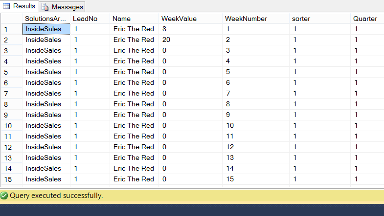
With the ‘current employee’, we utilize his name, the solutions area (to which he belongs), and the lead to which he was following. On the first pass through the loop, the counter has a value of 1 and therefore the value contained within the variable “Weekvalue” contains the value for the table field “Week01” (see the case logic within the code listing in Addenda1). The entire record the then written to the table variable and then the counter incremented by 1. As long as the incremented counter has not reached 53 then iteration continues with the next value being 2 (in our case). Obviously, the first part of our record retains the same solutions area, name, and lead. The only value that changes is the value of “Weekvalue”. It now takes the value of the database table field “Week02” (for THAT employee).
Once the counter has reached 53, we break from the loop and we find ourselves back in the main “fetch” of the cursor. The next employee is then obtained and so the cycle continues until we run out of employees.
At the end of the process we transfer the contents of the table variable to a temporary table (#rawdata33). The reason that we do so is to ensure persistence of the result set, in case a “GO” statement (or the like) is encountered further down the code listing. As we know, a “GO” statement by nature assumes that you are finished with the table variable and thus is one of the Gotcha’s you wish to avoid.
It should be clearly understood that the same processing could have been achieved by utilizing two while loops. In most cases this is preferable, as we normally avoid the use of a cursor.
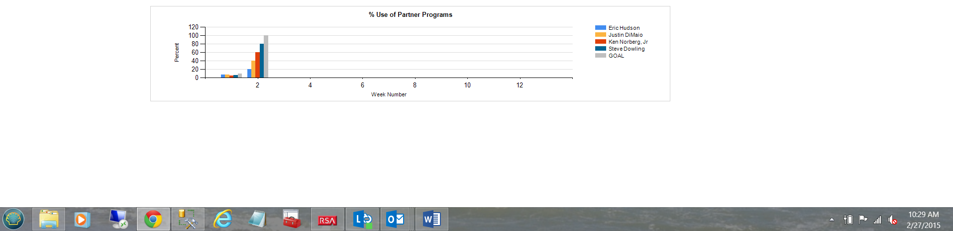
The “eagle-eyed” reader will have noted that in many of the screen dumps (that I have shown thus far), a variable called “@Sorter is displayed. A value of 1 is assigned to each “real” employee and a value of 99 is assigned to a dummy employee called “GOAL”. The goal is not really an employee but will be utilized in our reporting to show the enterprises total goals for any particular week. Thus when we look at our weekly results, we should see the following: Note the employees, the last one being “GOAL”
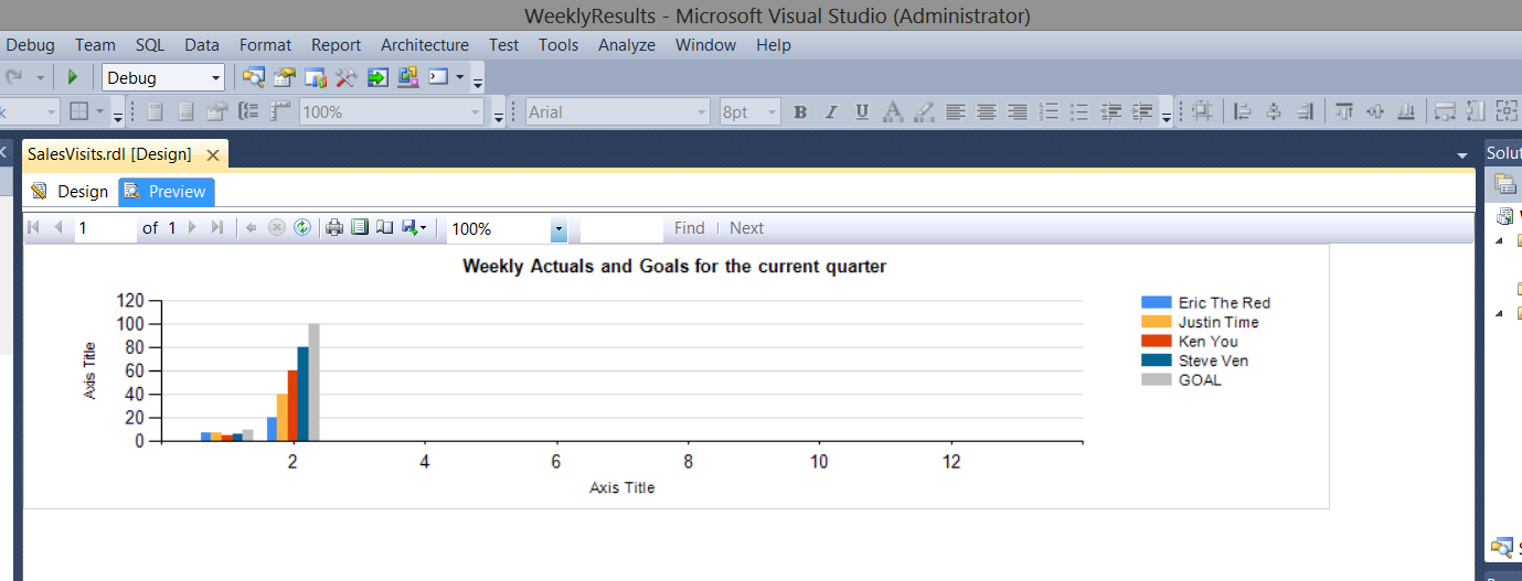
Note the grey bar to the right of the chart showing the enterprise goal. It appears to the right, as within the report we have set the sorting (for each week) to sort by @sorter ascending. More on this when we construct our report.
Creating our end client reports
As we can understand when it comes to reporting, report “real estate” is always problematic. This was the case when I created the first report for our end client. The report was just “to busy” and nothing could be gleaned without utilizing a magnifying glass.
This said we decided to show only data from the current quarter (as determined by the SQL Server Getdate() function) within our report.
In order to achieve this, we must alter our data extraction query to only pull data from the current quarter.
|
1 2 3 |
set @Yearr = (select convert(varchar(4),convert(date,Getdate()))) |
We first ascertain which year we are in. In our case, this will be 2015 and as such we utilize the “datepart” function to extract the current year (see above).
This achieved, we are in a position to define the “quarter” that we shall show to the end client and once again, this will depend upon the quarter in which the current date is found. As an example February 28th will fall in quarter 1. I would see weekly results from January 1st through February 28th. Had this been the 28th of May, then the results would have been from April 1st through May 28th.
|
1 2 3 4 5 6 7 8 |
Set @Quarter = (case when convert(date,GetDate()) between Convert(date,@Yearr +'0101') and Convert(date,@Yearr +'0331') then '1 and 13' when convert(date,GetDate()) between Convert(date,@Yearr +'0401') and Convert(date,@Yearr +'0630') then '14 and 26' when convert(date,GetDate()) between Convert(date,@Yearr +'0701') and Convert(Date,@Yearr +'0930') then '27 and 39' else '40 and 52' end) |
The code above, helps us achieve this.
Note that @quarter has been defined as Varchar(50). In the case that the current date falls within the first quarter, then the value that will be set for @quarter will be ‘1 and 13’.
|
1 2 3 4 5 6 7 8 9 |
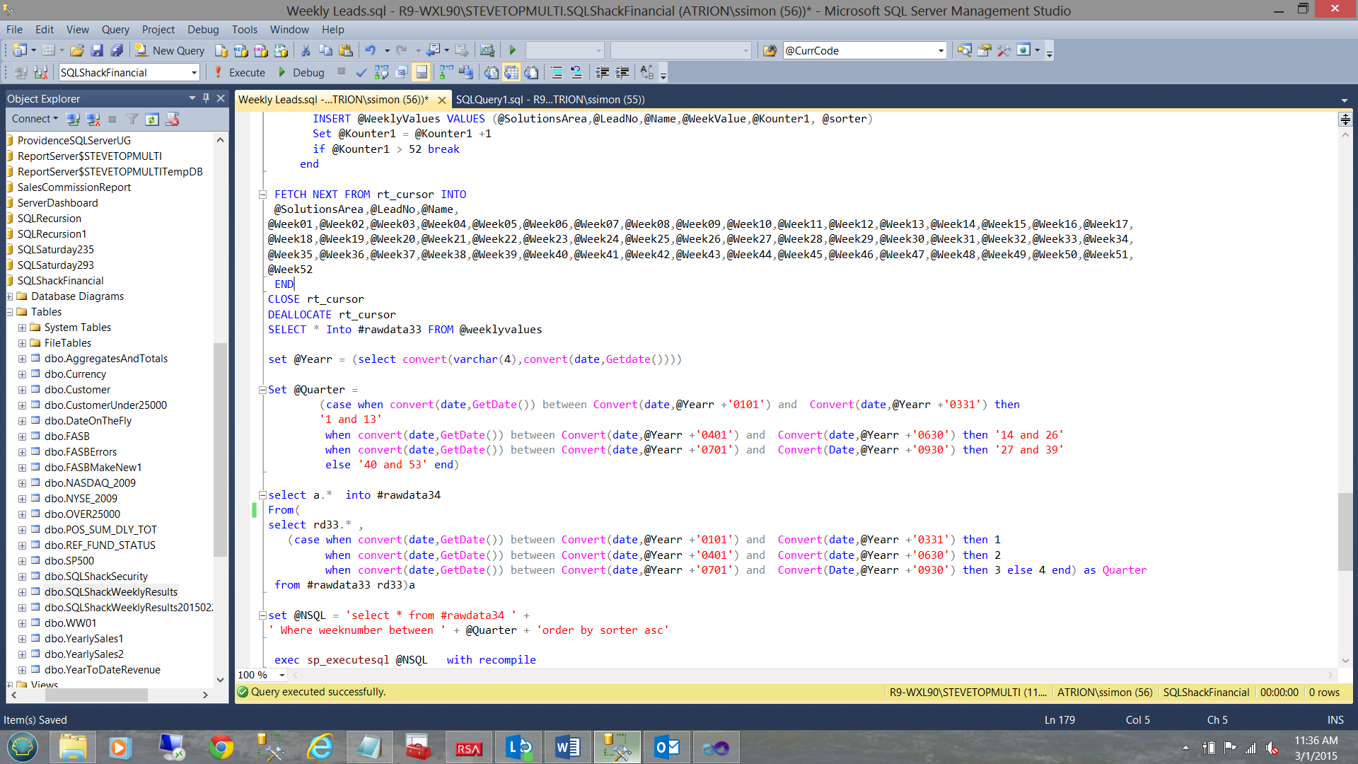
select a.* into #rawdata34 From( select rd33.* , (case when convert(date,GetDate()) between Convert(date,@Yearr +'0101') and Convert(date,@Yearr +'0331') then 1 when convert(date,GetDate()) between Convert(date,@Yearr +'0401') and Convert(date,@Yearr +'0630') then 2 when convert(date,GetDate()) between Convert(date,@Yearr +'0701') and Convert(Date,@Yearr +'0930') then 3 else 4 end) as Quarter from #rawdata33 rd33)a |
The code above is a bit complex. Let us have a look at the code in green. What is happening is that we are taking all the fields from the temporary table “#rawdata33” (discussed above) and adding one last field. This field which I call “quarter” not to be confused with the variable “@quarter”.
The code in green would generate an extract similar to the one shown below:
This achieved, we now place the result set into another temporary table (#rawdata34), the reason for doing so will become evident within a few seconds (see the code in red below).
|
1 2 3 4 5 6 7 8 9 10 |
select a.* into #rawdata34 From( select rd33.* , (case when convert(date,GetDate()) between Convert(date,@Yearr +'0101') and Convert(date,@Yearr +'0331') then 1 when convert(date,GetDate()) between Convert(date,@Yearr +'0401') and Convert(date,@Yearr +'0630') then 2 when convert(date,GetDate()) between Convert(date,@Yearr +'0701') and Convert(Date,@Yearr +'0930') then 3 else 4 end) as Quarter from #rawdata33 rd33 )a |
Our next task is to define one last variable @NSQL defined as a NVARCHAR(2000). We construct the following SQL Statement and place the “string” into our @NSQL variable(see below).
|
1 2 3 4 |
set @NSQL = 'select * from #rawdata34 ' + ' Where weeknumber between ' + @Quarter + 'order by sorter asc' |
The reason behind this madness is to be able to execute THIS statement ( i.e. @NSQL ) at run time (see below).
|
1 2 3 |
exec sp_executesql @NSQL with recompile |
The end result will be that from the original records, only the records from the first quarter will be extracted.
Creating the necessary user report
Opening SQL Server Development Tools we create a Reporting Services project.
As we have done in past, we create our “Shared Data Source”.
Should you be unfamiliar with creating projects, creating data source connections and datasets (within SQL Server Reporting Services), do have a look at my article entitled “Now you see it, now you don’t” /now-see-now-dont/ where the process is described in detail.
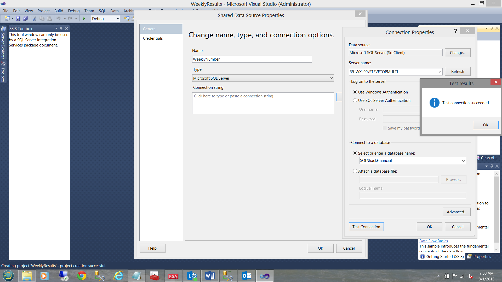
We create our shared data source called “WeeklyNumber” and point this to our SQLShackFinancial database (see above).
Having created our “Shared Data Source” we now create our first and only report.
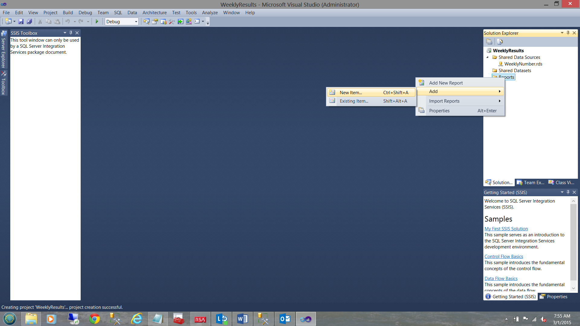
We right-click upon our report folder and select “Add” and “New Item” (from the context menu). See above.
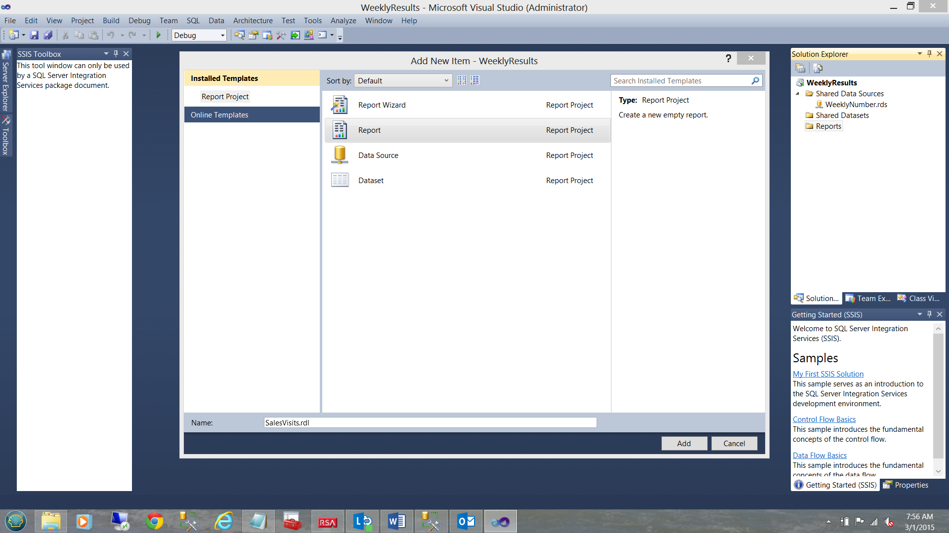
We select “Report” from the “Add New Item” menu (see above and to the middle). We give our report the name “SalesVisits”. We click “Add”.
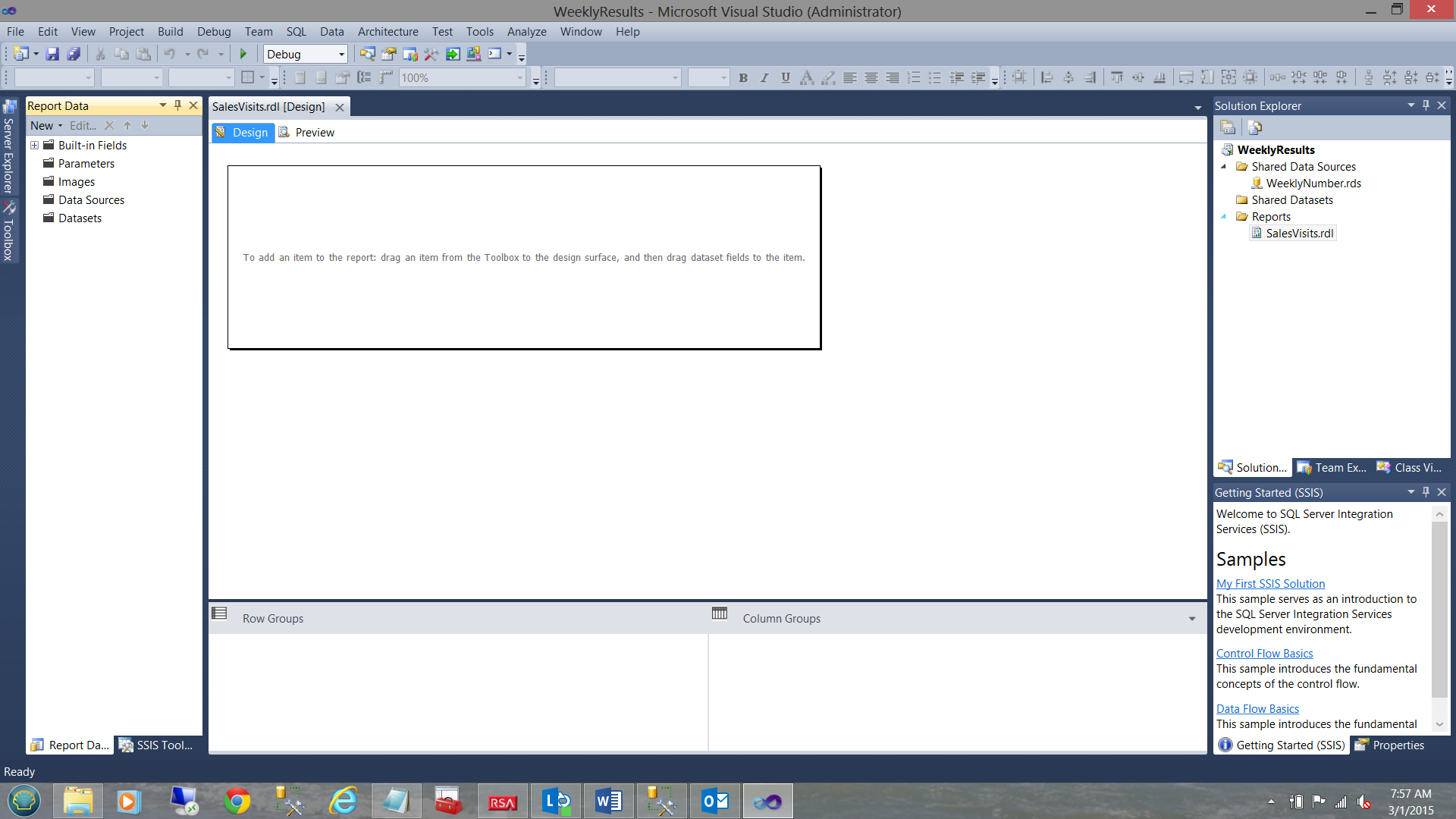
Our report work surface is brought up (see above).
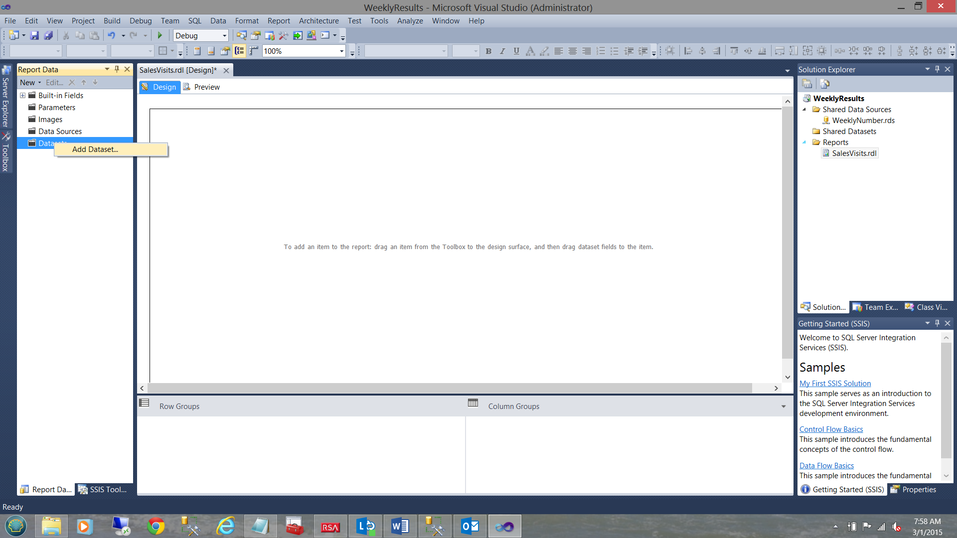
We now add a dataset by right-clicking on the “Dataset” folder and selecting “Add Dataset” from the context menu (see above).
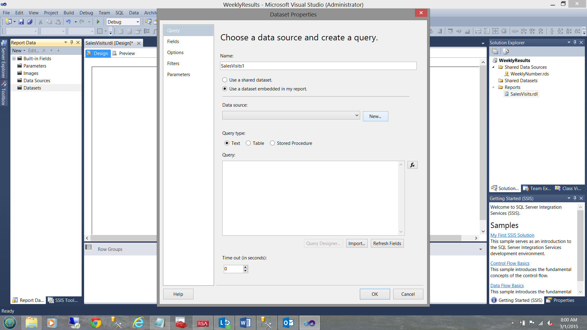
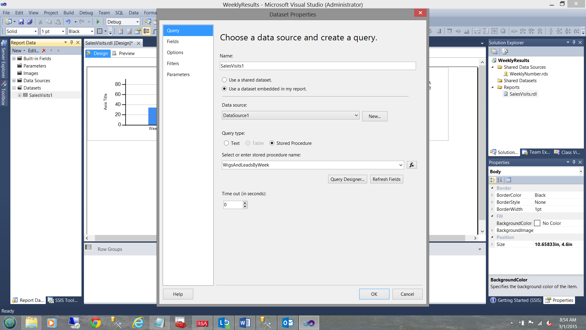
We find ourselves within the “Dataset Properties” dialogue box. We give our dataset the name “SalesVisits1”. We also select the “Use a dataset embedded in my report” option (see above). We click the “New” button to the right of the “Data source” drop down to create an “embedded” or local data source.
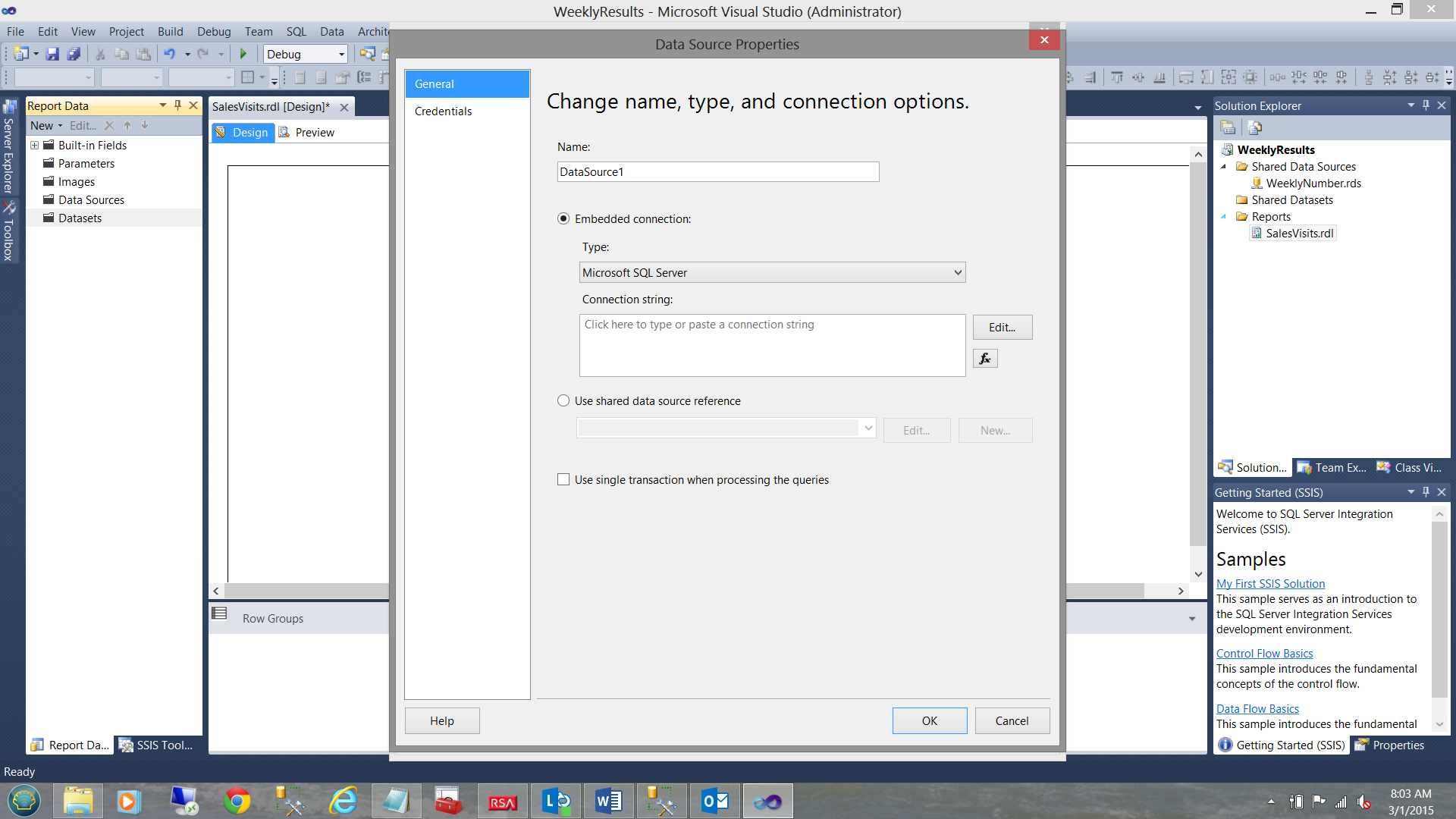
The “Data Source Properties” dialogue box is presented to us (see above).
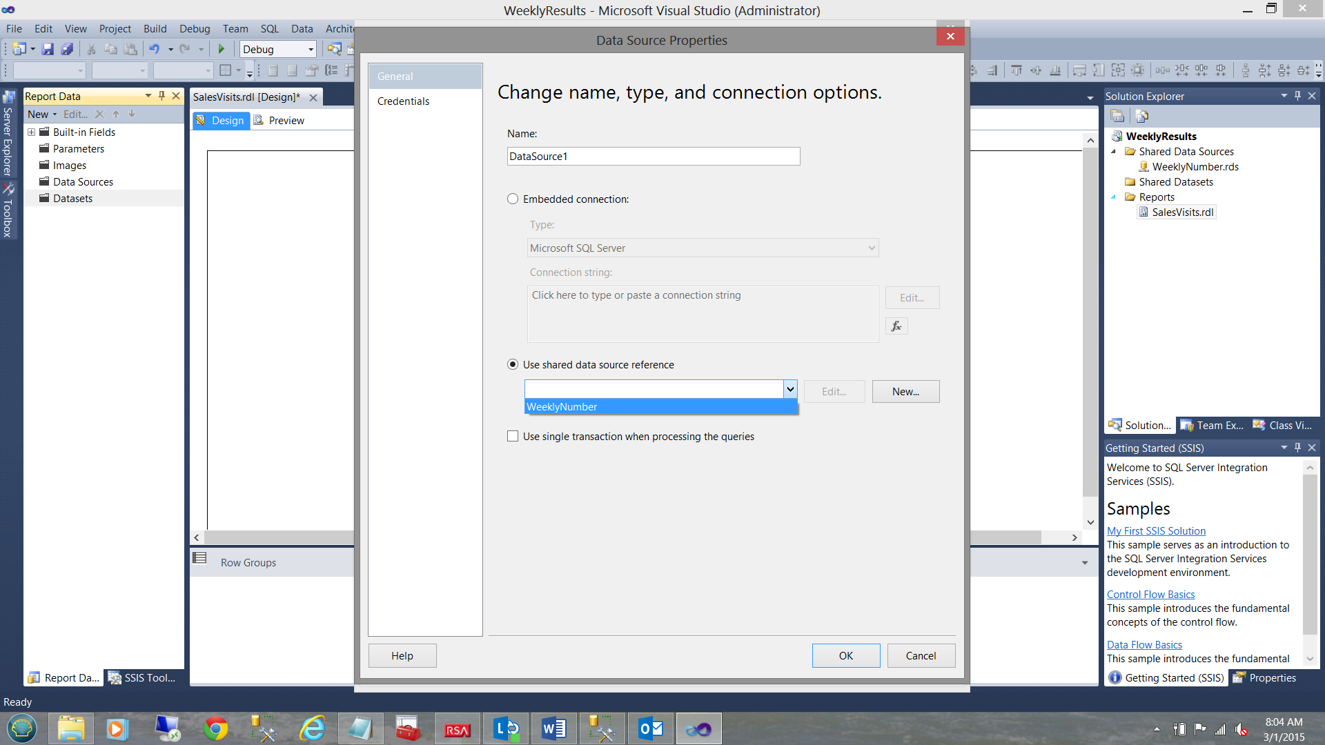
We opt to use the “Shared data source” that we created above (see the screenshot above). We click “OK” to accept our shared data source.
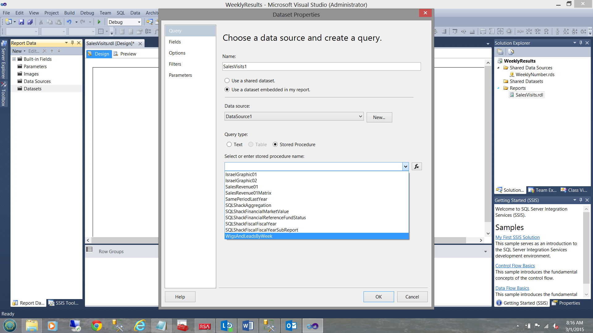
We find ourselves back on the “Dataset Properties” window. We select the stored procedure called “WigsAndLeadsByWeek” which is the name that I gave to the stored procedure that I created from the query that we have been discussing above (see the screenshot above). We click “OK” to leave this window.
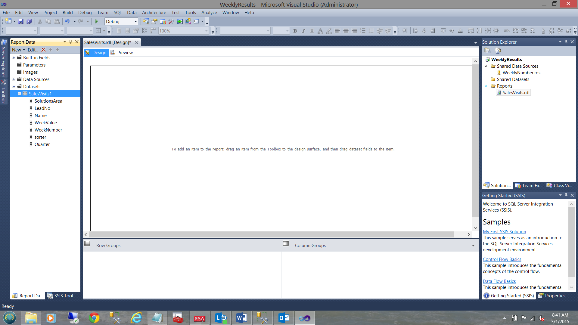
We find ourselves back on our report surface.
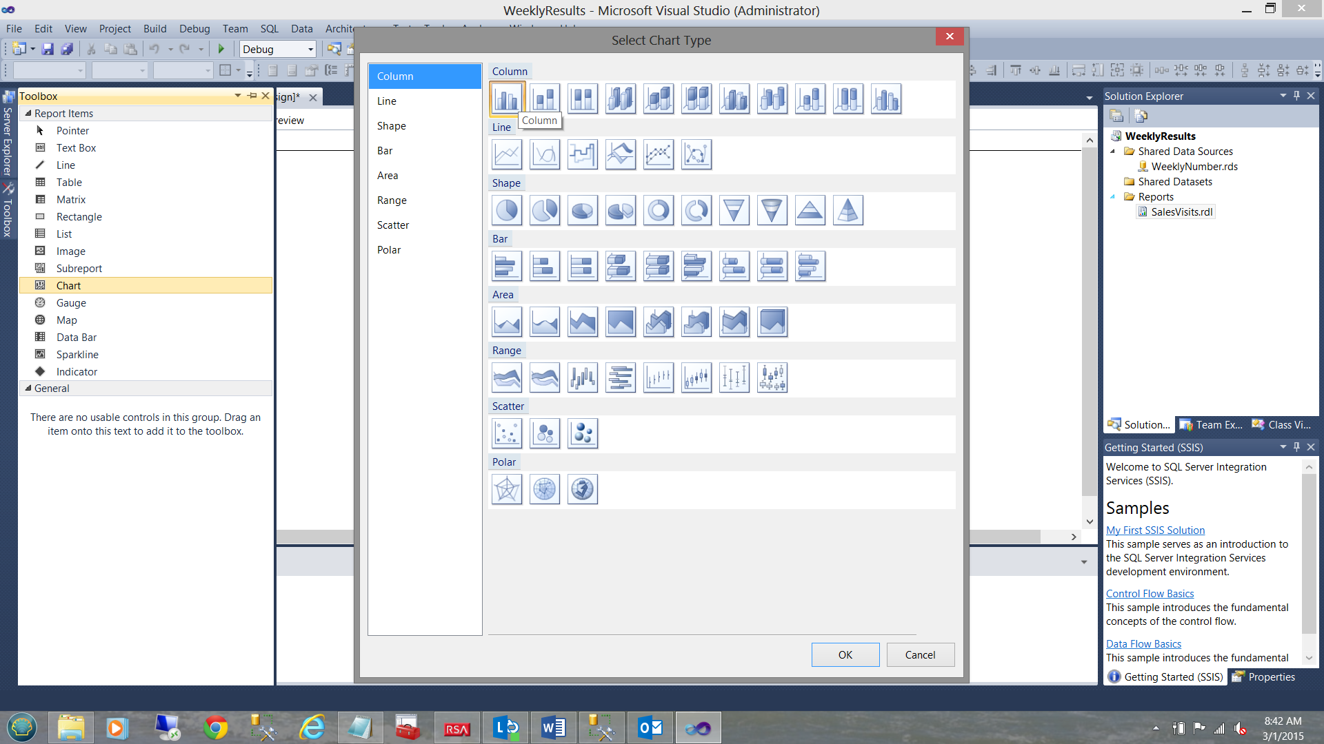
From our toolbox, we select a vertical bar chart to place upon our drawing surface (see above).
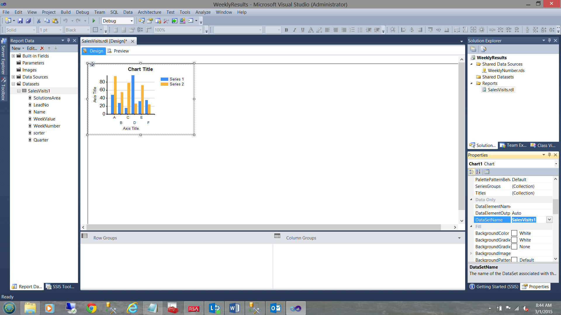
We note that the bar chart now appears upon our drawing surface. Within the properties window, we set the “DataSetName” property (of the chart) to the name of the dataset that we have just created (see above).
Expanding our chart and giving it a title, we are now in a position to assign the chart data.
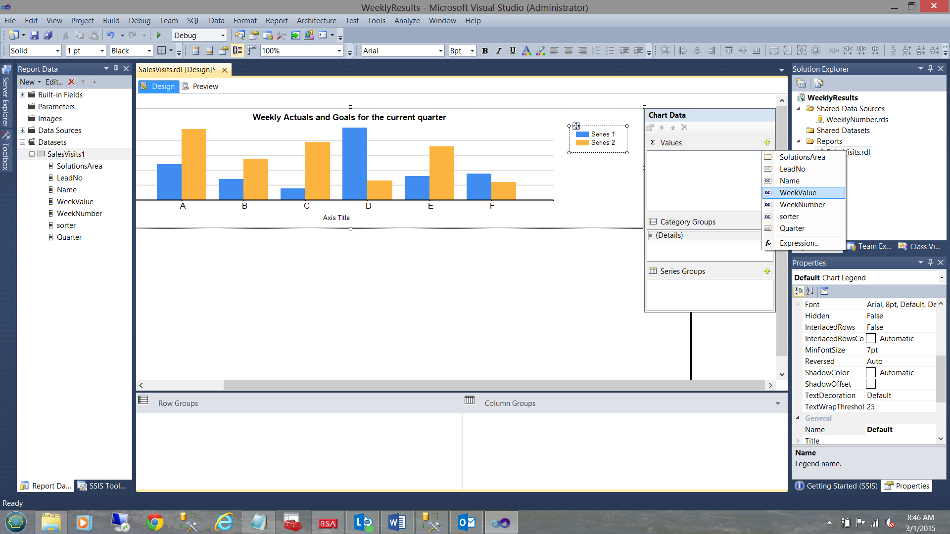
We set the ∑ values to “WeekValue” (see above).
The “Category Groups” are set to the week number (see above).
The “Series Group’’ is set to “Name” (i.e. employee names).
Opening our dataset once again we are going to set a few filters. The reason for this is because while this example is a simple one, the client planned to use the same dataset for other solutions areas and other lead numbers. This way our dataset is generic.
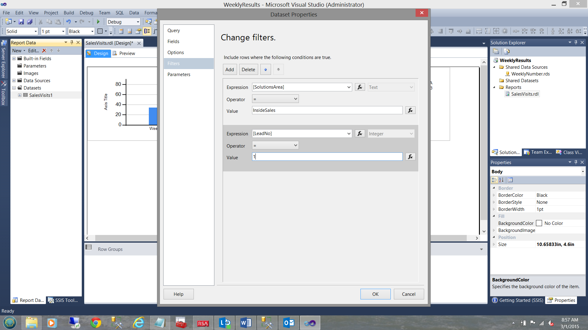
We set our solutions area to “InsideSales” and our lead number to a value of 1 (see above).
Hey!! What about the @sorter variable about which we spoke
Our final task is to ensure that when the results are displayed that, the “GOAL” is shown as the last vertical bar (for each week that is displayed).
To ensure this happens, we right click upon “Names Series” grouping (see below).
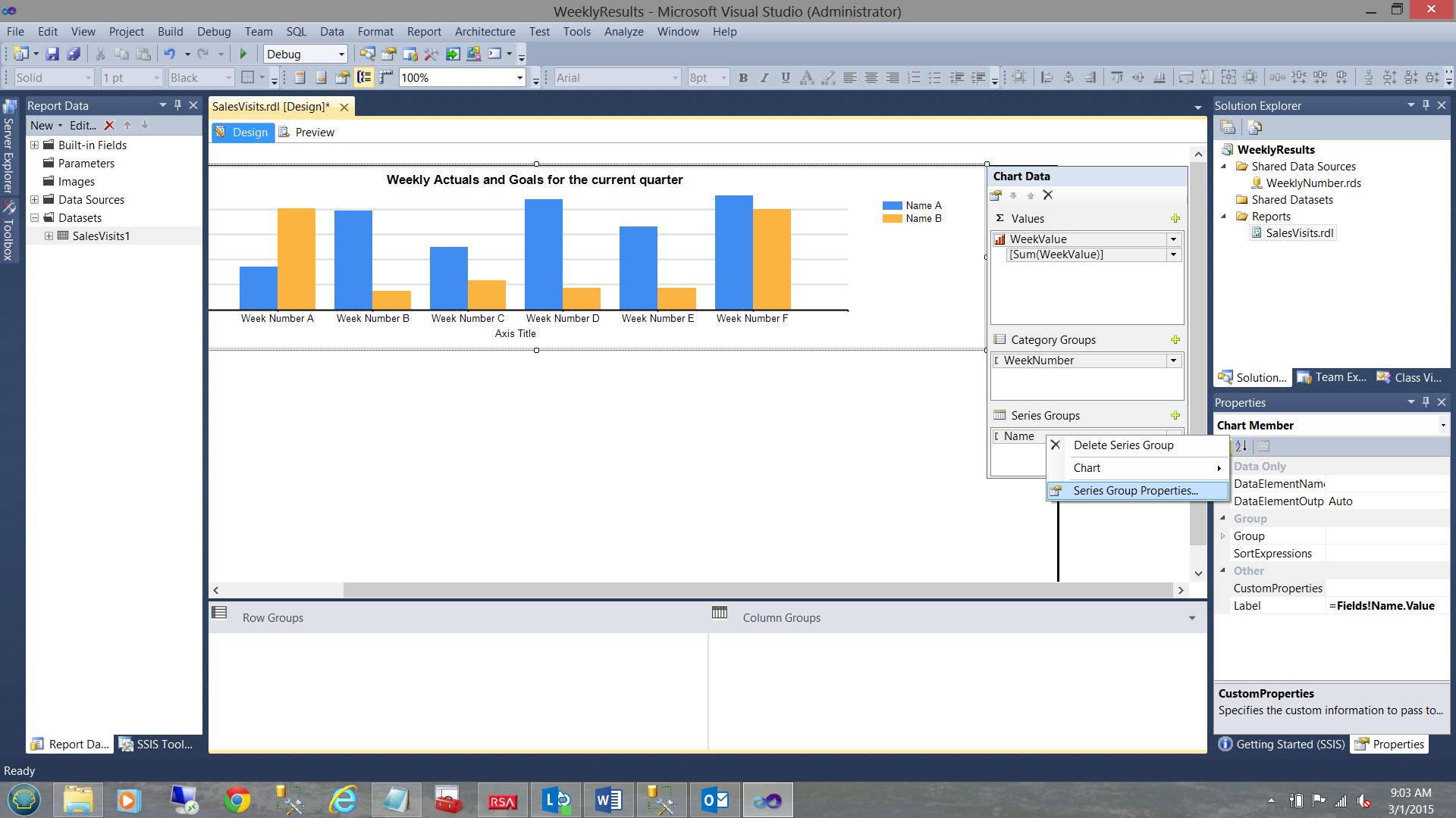
We note that the context menu is brought up. We select “Series Group Properties” (see above).
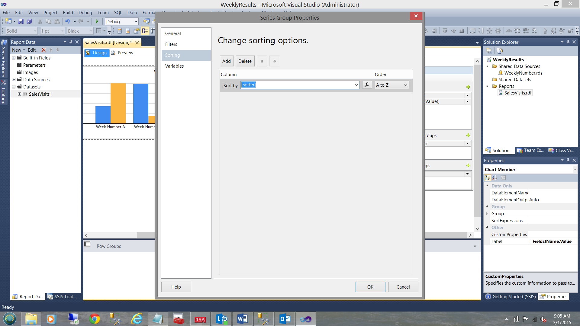
The “Series Group Properties” Dialog box is brought into view. We change the “Sort by” field to our “sorter” field (see above). We ensure that the “Order” drop-down is set to “A to Z”.
This will ensure that the sorter “99” associated with “GOAL” records will be the last name for each week (see above). We click “OK” to leave this dialogue box.
Let us give it a run!
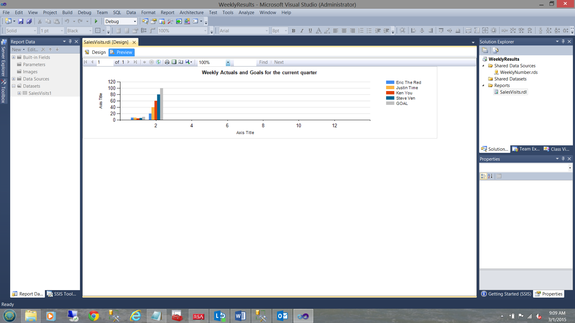
Clicking on the “Preview” tab, we are able to see the results. In our case, the reader will note that the corporate goals are grey in color and they are in fact the last vertical bar for each week.
Conclusions
Thus we have achieved our end goal of converting the format of data (which was not conducive to being utilized with a vertical bar chart) into a dataset which would enable us to produce valuable corporate information.
User resistance to change is not the exception but rather the rule. We often have to massage data prior to getting it into a usable format. In our case, this was an end user, addicted to utilizing a spreadsheet and in a format that he or she felt comfortable using.
Finally, it is important (as most people will tell you) to think outside of the box and to be able to convert end user-generated challenges into productive and functional solutions.
As a reminder, all the code used within the query may be found in the code listing in Addenda 1.
Also please remember that should you wish to obtain a copy of the Reporting Services project do contact me.
In the interim, happy programming!!
Addenda 1
|
1 2 3 4 5 6 7 8 9 10 11 12 13 14 15 16 17 18 19 20 21 22 23 24 25 26 27 28 29 30 31 32 33 34 35 36 37 38 39 40 41 42 43 44 45 46 47 48 49 50 51 52 53 54 55 56 57 58 59 60 61 62 63 64 65 66 67 68 69 70 71 72 73 74 75 76 77 78 79 80 81 82 83 84 85 86 87 88 89 90 91 92 93 94 95 96 97 98 99 100 101 102 103 104 105 106 107 108 109 110 111 112 113 114 115 116 117 118 119 120 121 122 123 124 125 126 127 128 129 130 131 132 133 134 135 136 137 138 139 140 141 142 143 144 145 146 147 148 149 150 151 152 153 154 155 156 157 158 159 160 161 162 163 164 165 166 167 168 169 170 171 172 173 174 175 176 177 178 179 180 181 182 183 184 185 186 187 188 189 190 191 192 193 194 195 196 197 198 199 200 201 202 203 204 205 206 |
use [SQLShackFinancial] go IF OBJECT_ID(N'tempdb..#rawdata1') IS NOT NULL BEGIN DROP TABLE #rawdata1 END IF OBJECT_ID(N'tempdb..#rawdata33') IS NOT NULL BEGIN DROP TABLE #rawdata33 END IF OBJECT_ID(N'tempdb..#rawdata34') IS NOT NULL BEGIN DROP TABLE #rawdata34 END IF OBJECT_ID(N'tempdb..#rawdata55') IS NOT NULL BEGIN DROP TABLE #rawdata55 END go Alter procedure WigsAndLeadsByWeek as Declare @SolutionsArea as Varchar(50) Declare @LeadNo as int Declare @NSQL as nvarchar(2000) Declare @Yearr as varchar(4) Declare @Name as varchar(50) declare @quarter as Varchar(50) Declare @Week01 as Int Declare @Week02 as Int Declare @Week03 as Int Declare @Week04 as Int Declare @Week05 as Int Declare @Week06 as Int Declare @Week07 as Int Declare @Week08 as Int Declare @Week09 as Int Declare @Week10 as Int Declare @Week11 as Int Declare @Week12 as Int Declare @Week13 as Int Declare @Week14 as Int Declare @Week15 as Int Declare @Week16 as Int Declare @Week17 as Int Declare @Week18 as Int Declare @Week19 as Int Declare @Week20 as Int Declare @Week21 as Int Declare @Week22 as Int Declare @Week23 as Int Declare @Week24 as Int Declare @Week25 as Int Declare @Week26 as Int Declare @Week27 as Int Declare @Week28 as Int Declare @Week29 as Int Declare @Week30 as Int Declare @Week31 as Int Declare @Week32 as Int Declare @Week33 as Int Declare @Week34 as Int Declare @Week35 as Int Declare @Week36 as Int Declare @Week37 as Int Declare @Week38 as Int Declare @Week39 as Int Declare @Week40 as Int Declare @Week41 as Int Declare @Week42 as Int Declare @Week43 as Int Declare @Week44 as Int Declare @Week45 as Int Declare @Week46 as Int Declare @Week47 as Int Declare @Week48 as Int Declare @Week49 as Int Declare @Week50 as Int Declare @Week51 as Int Declare @Week52 as Int --Place the data from the table into a temp file as you do not want to lock records in the table --itself when the cursor is run SELECT * into #rawdata1 FROM [dbo].[SQLShackWeeklyResults] DECLARE @WeeklyValues TABLE(SolutionsArea Varchar(255),LeadNo Int, Name varchar(255),WeekValue int,WeekNumber int,sorter int) DECLARE @sorter int, @Whichmonth2 int , @WeekNo as int, @WeekValue as int, @kounter1 as int Set @kounter1 =0 --SET @RunningTotal = 0.0 DECLARE rt_cursor CURSOR FOR SELECT * FROM #rawdata1 OPEN rt_cursor FETCH NEXT FROM rt_cursor INTO @SolutionsArea,@LeadNo,@Name, @Week01,@Week02,@Week03,@Week04,@Week05,@Week06,@Week07,@Week08,@Week09,@Week10,@Week11,@Week12,@Week13,@Week14,@Week15,@Week16,@Week17, @Week18,@Week19,@Week20,@Week21,@Week22,@Week23,@Week24,@Week25,@Week26,@Week27,@Week28,@Week29,@Week30,@Week31,@Week32,@Week33,@Week34, @Week35,@Week36,@Week37,@Week38,@Week39,@Week40,@Week41,@Week42,@Week43,@Week44,@Week45,@Week46,@Week47,@Week48,@Week49,@Week50,@Week51, @Week52 WHILE @@FETCH_STATUS = 0 BEGIN Set @Kounter1 = 1 while @Kounter1 <53 begin Set @Weekvalue = (Select case When @kounter1 = 1 then @Week01 When @kounter1 = 2 then @Week02 When @kounter1 = 3 then @Week03 When @kounter1 = 4 then @Week04 When @kounter1 = 5 then @Week05 When @kounter1 = 6 then @Week06 When @kounter1 = 7 then @Week07 When @kounter1 = 8 then @Week08 When @kounter1 = 9 then @Week09 When @kounter1 = 10 then @Week10 When @kounter1 = 11 then @Week11 When @kounter1 = 12 then @Week12 When @kounter1 = 13 then @Week13 When @kounter1 = 14 then @Week14 When @kounter1 = 15 then @Week15 When @kounter1 = 16 then @Week16 When @kounter1 = 17 then @Week17 When @kounter1 = 18 then @Week18 When @kounter1 = 19 then @Week19 When @kounter1 = 20 then @Week20 When @kounter1 = 21 then @Week21 When @kounter1 = 22 then @Week22 When @kounter1 = 23 then @Week23 When @kounter1 = 24 then @Week24 When @kounter1 = 25 then @Week25 When @kounter1 = 26 then @Week26 When @kounter1 = 27 then @Week27 When @kounter1 = 28 then @Week28 When @kounter1 = 29 then @Week29 When @kounter1 = 30 then @Week30 When @kounter1 = 31 then @Week31 When @kounter1 = 32 then @Week32 When @kounter1 = 33 then @Week33 When @kounter1 = 34 then @Week34 When @kounter1 = 35 then @Week35 When @kounter1 = 36 then @Week36 When @kounter1 = 37 then @Week37 When @kounter1 = 38 then @Week38 When @kounter1 = 39 then @Week39 When @kounter1 = 40 then @Week40 When @kounter1 = 41 then @Week41 When @kounter1 = 42 then @Week42 When @kounter1 = 43 then @Week43 When @kounter1 = 44 then @Week44 When @kounter1 = 45 then @Week45 When @kounter1 = 46 then @Week46 When @kounter1 = 47 then @Week47 When @kounter1 = 48 then @Week48 When @kounter1 = 49 then @Week49 When @kounter1 = 50 then @Week50 When @kounter1 = 51 then @Week51 When @kounter1 = 52 then @Week52 else 999 end ) Set @sorter = (case When @Name = 'Goal' then 99 else 1 end) INSERT @WeeklyValues VALUES (@SolutionsArea,@LeadNo,@Name,@WeekValue,@Kounter1, @sorter) Set @Kounter1 = @Kounter1 +1 if @Kounter1 > 52 break end FETCH NEXT FROM rt_cursor INTO @SolutionsArea,@LeadNo,@Name, @Week01,@Week02,@Week03,@Week04,@Week05,@Week06,@Week07,@Week08,@Week09,@Week10,@Week11,@Week12,@Week13,@Week14,@Week15,@Week16,@Week17, @Week18,@Week19,@Week20,@Week21,@Week22,@Week23,@Week24,@Week25,@Week26,@Week27,@Week28,@Week29,@Week30,@Week31,@Week32,@Week33,@Week34, @Week35,@Week36,@Week37,@Week38,@Week39,@Week40,@Week41,@Week42,@Week43,@Week44,@Week45,@Week46,@Week47,@Week48,@Week49,@Week50,@Week51, @Week52 END CLOSE rt_cursor DEALLOCATE rt_cursor SELECT * Into #rawdata33 FROM @weeklyvalues set @Yearr = (select convert(varchar(4),convert(date,Getdate()))) Set @Quarter = (case when convert(date,GetDate()) between Convert(date,@Yearr +'0101') and Convert(date,@Yearr +'0331') then '1 and 13' when convert(date,GetDate()) between Convert(date,@Yearr +'0401') and Convert(date,@Yearr +'0630') then '14 and 26' when convert(date,GetDate()) between Convert(date,@Yearr +'0701') and Convert(Date,@Yearr +'0930') then '27 and 39' else '40 and 53' end) select a.* into #rawdata34 From( select rd33.* , (case when convert(date,GetDate()) between Convert(date,@Yearr +'0101') and Convert(date,@Yearr +'0331') then 1 when convert(date,GetDate()) between Convert(date,@Yearr +'0401') and Convert(date,@Yearr +'0630') then 2 when convert(date,GetDate()) between Convert(date,@Yearr +'0701') and Convert(Date,@Yearr +'0930') then 3 else 4 end) as Quarter from #rawdata33 rd33)a set @NSQL = 'select * from #rawdata34 ' + ' Where weeknumber between ' + @Quarter + 'order by sorter asc' exec sp_executesql @NSQL with recompile go |
Steve has presented papers at 8 PASS Summits and one at PASS Europe 2009 and 2010. He has recently presented a Master Data Services presentation at the PASS Amsterdam Rally.
Steve has presented 5 papers at the Information Builders' Summits. He is a PASS regional mentor.
View all posts by Steve Simon
- Reporting in SQL Server – Using calculated Expressions within reports - December 19, 2016
- How to use Expressions within SQL Server Reporting Services to create efficient reports - December 9, 2016
- How to use SQL Server Data Quality Services to ensure the correct aggregation of data - November 9, 2016